

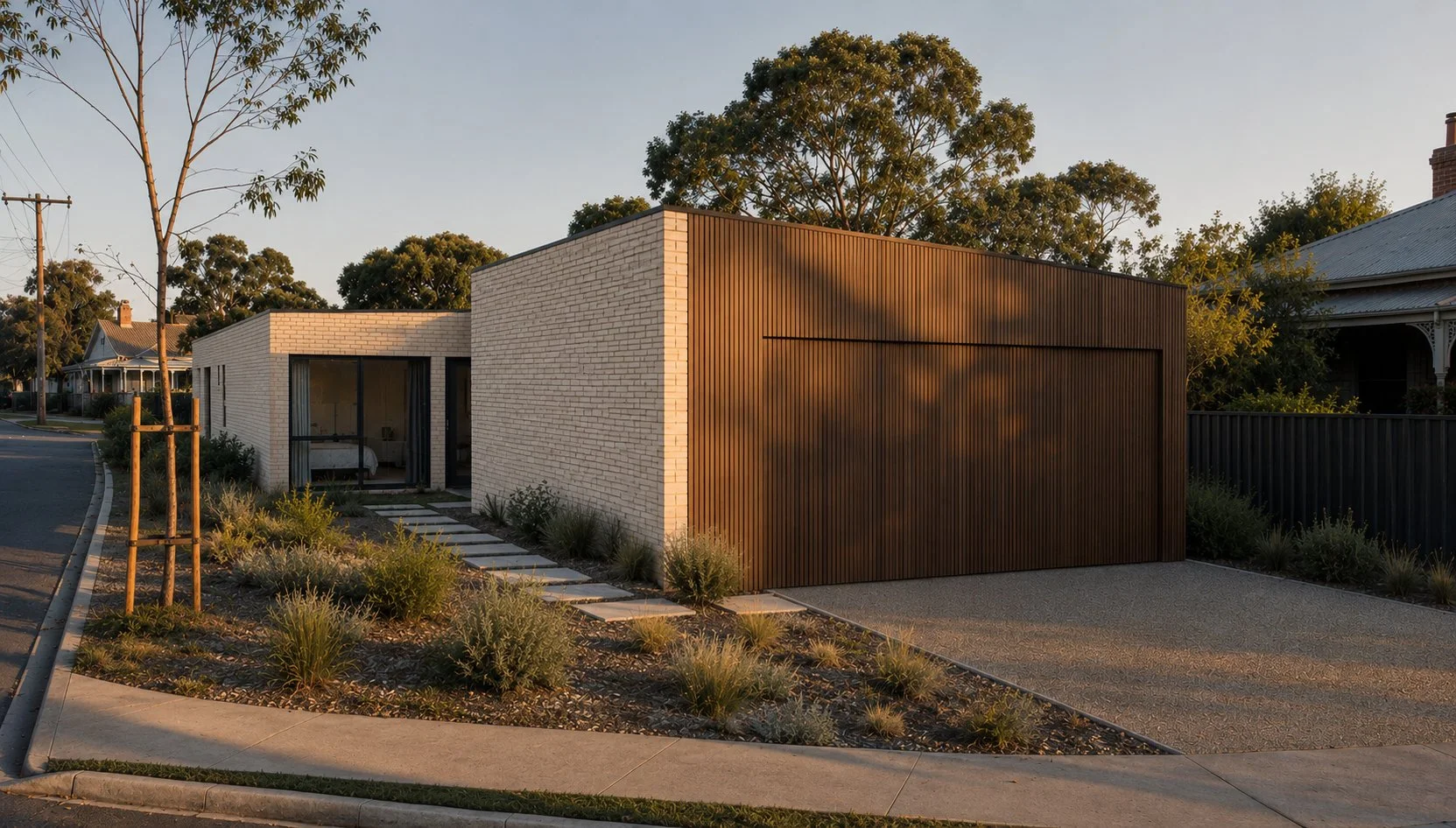
Building Smarter: Why Market Research Should Shape Design
A current Bairnsdale project raised an interesting question: how far do you push design without hurting budget and final resale? Exploring demographics, market research, buyer behaviour and current housing reform discussions, this project looks at why standing out doesn't necessarily mean spending more, and how thoughtful design decisions can create stronger commercial outcomes.
Dromana Renovation: Turning a “Pizza Hut on the Hill” Into a Coastal Heavyweight
A Dromana renovation transforming a bold hilltop home into a calm, coastal retreat designed to work as both a private residence and high-performing holiday rental.
Playing the long game.
How thoughtful styling carried a multi-residential project from early renders to resident handover, creating cohesive spaces built to last.
It’s Not The Size. It’s What You Do With It.
Interior design strategies for small apartments, first home buyers and inner-city living.
Buying your first apartment doesn’t have to feel like a compromise. This Lygon Street project proves that smart design decisions, not square metres, are what make a home feel considered, comfortable and genuinely yours.
When did we all agree plain white walls were the best way forward for humanity?
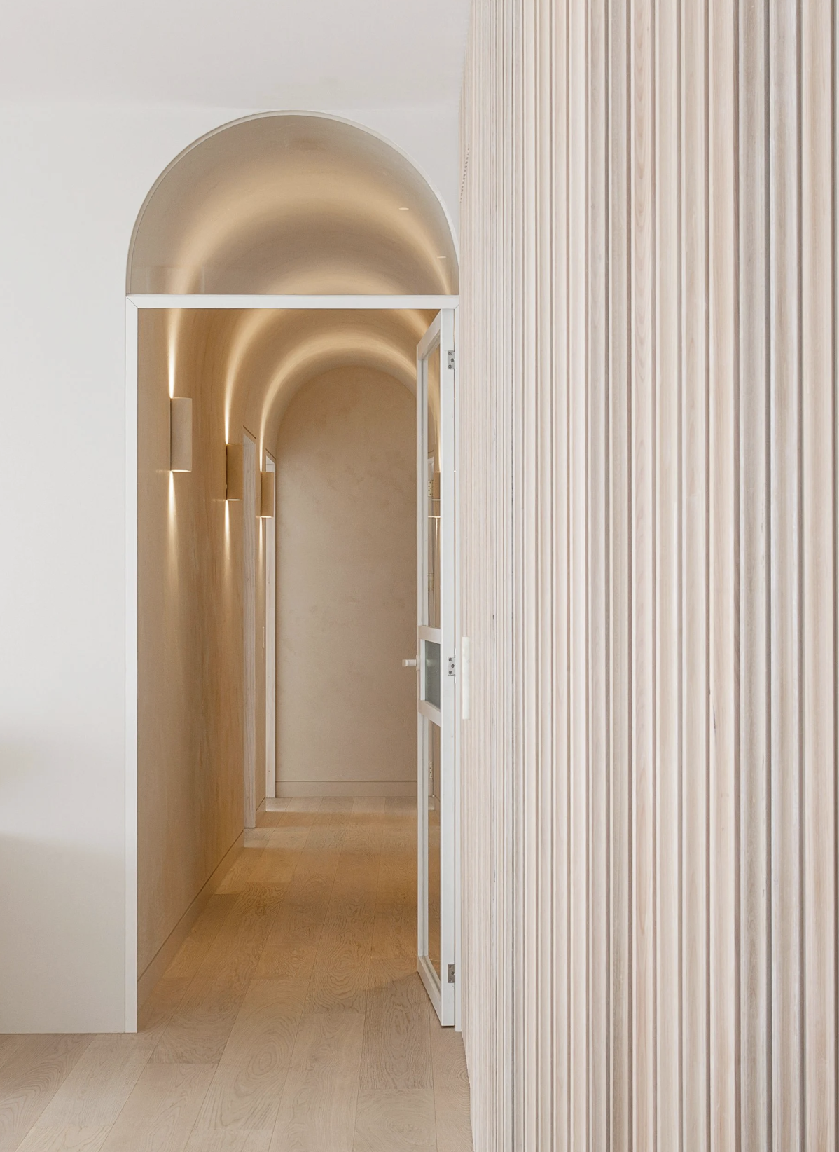
Wall treatments are one of the most overlooked design decisions in a home, yet they have the power to completely transform how a space feels. From wainscoting and timber veneer panelling to Venetian plaster, micro cement, wallpaper and upholstered walls, considered wall finishes add depth, warmth and architectural interest beyond plain white paint. In this guide, we explore how different wall treatments work, where to use them, and how to choose the right option for your home, with real-world interior design examples from Melbourne projects.

Brick Face Tiles: The Architectural Cheat You Didn’t Know You Needed
From fireplaces to feature walls, brick face tiles deliver texture, warmth and designer-level detail. See why they’re ideal for renovations and how to choose the right style.
Paint on a Budget: Transform Your Interiors with These Easy DIY Paint Ideas (Even If You Ignore the Bunnings Guy)
Ready to give your space a makeover without blowing the budget? Discover the power of paint—the ultimate affordable design trick that packs a punch. From limewash finishes to colour drenching, hand-painted patterns and even DIY ombre walls (for the brave), this guide is full of creative ways to transform your interiors. No tradies required—just a brush, a bold idea, and maybe a quick chat with your local Bunnings expert.
Perfect for renters, renovators, and design lovers on a shoestring.

Budget Beautiful: My Favourite Affordable Interior Picks That Pack a Punch
Want to style your home without blowing the budget? Discover my favourite affordable interior buys — from $19 side tables to plush pillows and bold DIY paint ideas. These budget-friendly picks prove you don’t need big bucks for beautiful design.

You’ve Bought a Holiday Home, Lucky You… Now What?
Bought a holiday house and now staring at blank walls or mismatched furniture? Discover how turnkey holiday home styling can transform your space into a casually luxe retreat or a scroll-stopping Airbnb. Save time, avoid stress, and walk into a fully furnished, ready-to-relax getaway—wine in hand, guests envious.

Minimalist Magic in Hampton: A Story of Transformation
Let’s face it: this townhouse had good bones, but its beige-on-beige “developer chic” look wasn’t doing it any favours. The brief? A modern, budget-friendly interior makeover that elevated key spaces without a full renovation. The result? A calm, Japandi-inspired transformation with just the right amount of wow.

So You Hired an Architect and a Builder, But No Interior Designer? Let’s Talk.
Got your architectural plans sorted? Great—but what about the interiors? Without a clear design plan, you risk last-minute decisions, budget blowouts, and builder frustration. From joinery to lighting, an interior designer ensures everything works seamlessly. Read on to see why smart planning now saves stress (and money) later.

Shoreham’s Dream American Farmhouse – A Forever Home, Built by Family
This Shoreham, Victoria new-build project is a perfect example of protecting a vision. My clients, a retired couple, started with a building designer but quickly realised interior design wasn’t included. That’s where I came in — to bring their love of classic American farmhouse design to life with a cohesive plan. From bespoke trims to vintage-inspired finishes, the result is a well-planned, seamless build with no last-minute surprises.

A Neo-Georgian Glow-Up in Toorak
This Toorak townhouse, once stuck in 1990s neo-Georgian style, gets a modern reinvention that honours its classical roots. With a fresh take on contemporary classic minimalism, this design blends high-quality materials, a refined monochromatic palette, and timeless charm with sleek modern touches. The result? A home that embraces its past while catapulting into the 21st century.

Colour Drenching: Because More is More (And It’s Glorious)
Colour drenching is the interior design equivalent of diving headfirst into a giant tin of paint. Instead of playing it safe with a feature wall, this trend takes one colour—walls, ceilings, doors, trims, the whole shebang—and absolutely soaks your space in it. The result? A beautifully immersive, cohesive, and effortlessly chic vibe that makes a statement without trying too hard (kind of like that friend who ‘woke up like this’ but you know has a 12-step skincare routine).

Future Nostalgia: Transforming a Tired Family Home into a Sophisticated Sanctuary.
How a tired Metricon family home received the ultimate interior design Glow-Up.

Quote Like A Pro: How to get your renovation quoted and choose the right builder
Rightly or wrongly, getting building quotes and appointing a builder is a massive source of anxiety for a lot of people. And fair enough, media is awash with horror stories of dodgy builders doing remarkably dodgy things. But here’s a few easy tips to help you accurately quote and assign a builder to your next renovation of home build.

New project Tour: Hampton Residence
Let’s face it: this townhouse had good bones, but its beige-on-beige “developer chic” look wasn’t doing it any favours. The brief? A modern, budget-friendly interior makeover that elevated key spaces without a full renovation. The result? A calm, Japandi-inspired transformation with just the right amount of wow.

New Project Tour: Rayner House Prahran
Nestled amidst a neighbourhood of vibrant markets, apartments and commercial buildings, is an urban oasis that’s a world removed from the outside hustle and bustle.

New Project: Pop Art House, Blairgowrie
Having a passion for mid-century furniture and an impressive collection of Charles Blackman artwork, client’s Denis and Jura were hoping to incorporate city-slicker art gallery sensibilities into a reimagined coastal interior that reflected the surrounding environment to add warmth, personality and a more contemporary aesthetic.

Style like a pro: Decision Fatigues
Overwhelmed by endless design options? You’re not alone. In this blog, we dive into the chaos of consumer choice and why trying to DIY your interiors often ends in decision fatigue. From 157 grey couches to the tyranny of too many throw pillow options, discover how a clear concept and a strong design plan can save your sanity—and your living room.