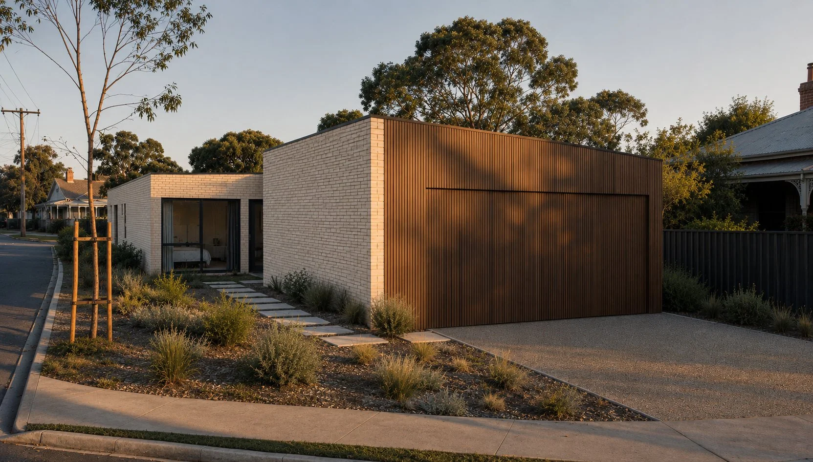
Budget Beautiful: My Favourite Affordable Interior Picks That Pack a Punch
Want to style your home without blowing the budget? Discover my favourite affordable interior buys — from $19 side tables to plush pillows and bold DIY paint ideas. These budget-friendly picks prove you don’t need big bucks for beautiful design.
With the ever-rising cost of living looming like an uninvited guest at a dinner party, I thought I’d jump online and share a few of my favourite budget-friendly finds. Because let’s be real — a gorgeous interior shouldn’t come with a side of financial ruin. You can have champagne style on a beer budget, and these little gems prove it.
1. The Humble Gladom Side Table – IKEA
The Ikea Gladom side table. The reigning queen of budget style.
Let’s kick things off with a classic: the Gladom side table from IKEA. This unassuming little number is wildly versatile — pop it beside the bed, next to the sofa, or even pair it with an ottoman or a lower coffee table for a luxe-looking nesting moment. The sky’s the limit, and at a tidy $19, it’s an absolute no-brainer.
They come in a variety of colours (bring back the bright red and yellow, please, IKEA gods), and they just work in so many spaces. Flexible, affordable, and kind of a design chameleon.
2. H&M Home Cushions — Stylish and Sturdy
H&M Home Cushions are bang-on trend and cheap enough for the dog to destroy.
Next up: H&M Home, specifically their cushion covers. With prices ranging from $15 to around $50, these are ideal if you’re after high-style, low-stress soft furnishings. Especially if you’ve got a dog like mine — Pedro the cushion destroyer — who likes to ‘nest’ in them. These ones I don’t mind him wrecking quite as much.
Pair them with their responsibly sourced feather-down inserts (also about $15) for a plump, designer look without the designer price tag. Polyester inserts are there too, if down's not your thing. And honestly, H&M Home is a bit of a goldmine for unique, interesting decor pieces — far more chic than your average “live, laugh, love” situation. (But hey, if that’s your vibe, I’m not here to judge.)
3. Hollowlight Pillows – Bed Bath & Table
The Bed Bath N Table HollowLight Pillow. The answer to every budget conscious stylist’s prayers.
While we’re still on the cushion train — I can’t go past Bed Bath & Table’s Hollowlight pillows. These are a styling essential in my book. I’ve probably bought hundreds over the years. No shame.
They’ve got that high loft for a plush, polished look and ring in at about $30 each. Totally fine for sleeping, but where they really shine is in your bed styling. You know, the excess pillow situation your partner complains about? “Babe, why do we need all these pillows?” Because we do, John. That’s why.
4. Paint – The DIY Power Move
Highlights from the Dulux 2025 Colour Forecast. Images courtesy of Dulux Australia
Finally, the ultimate bang-for-buck interior move: paint. A few tins and a weekend of effort can completely transform a space. Want drama? Go deep and moody. Need energy? Try something zesty and bright.
If you’re stuck for ideas, Dulux’s annual colour forecasts are worth a scroll. Bree Banfield and her team put together the most delicious palettes — a great launchpad if you want to be bold but don’t know where to begin. Dulux also breaks down all the how-tos: surface prep, paint types, tools — the lot. And worst-case scenario? If you hate it… just paint over it. You’re never more than a weekend away from a reset.
So there you have it — a few of my fave low-cost styling staples that deliver big impact. Interior design doesn’t have to be expensive to be beautiful — it just has to be clever. And if you’re looking for more budget-friendly tips or need help making a space feel special without splashing too much cash, you know where to find me.
A Neo-Georgian Glow-Up in Toorak
Neo-georgian drab get’s a fresh, sophisticated glow up.
The 1990s called… and they desperately want their house back. This Toorak townhouse, trapped in a time capsule of neo-Georgian fatigue—think overworked columns, heavy-handed detailing, and a little too much Dulux “low fat cheese single” beige—is long overdue for a shake-up. But instead of waging war against its classical roots, this reinvention leans in, embracing the home’s original DNA while injecting it with a fresh, contemporary perspective. Enter: contemporary classic minimalism. (Yes, that’s a thing… well, now it is anyway.) By blending high-quality materials, a refined monochromatic palette, and a balance of old-world charm with sleek modern design, this home is about to catapulted into the 21st century—without losing the best bits of its past. Becasue hey, the 90’s weren’t all bad…I think. Who can remember. If you survived the raving golden age you know exactly what I mean.
The Grand Entrance & Living Room: Moody Meets Monochrome
Step through the doors, and you’re immediately greeted by a carefully curated blend of old-world charm and crisp, modern refinement. Gone are the days of tired finishes and outdated detailing. Now, the space is all about contrast and texture—refinished Japan black floorboards add depth, while fresh Dulux Lexicon Quarter walls bring a bright, sophisticated crispness.
The living area is anchored by a brand-new marble fireplace, turning what was once a tired plain wall just trying to get by into a sculptural statement. But the real magic happens in the transition between spaces—specifically, the one we’ve affectionately dubbed The Tunnel of Love.
The Tunnel of Love: A Passageway Worth Swooning Over
If you think a hallway is just a hallway, think again. This one is a full-blown experience. Clad in rich, dark grain veneer by Navurban, this moody passageway isn’t just about aesthetics—it’s a lifestyle, seamlessly disguising the transition between the home’s original hardwood floors and the brand-new timber flooring replacing the (honestly, hideous) carpet in the living room. To tie it all together, a marble floor insert subtly marks the shift, creating a moment of quiet luxury that feels as intentional as it is striking. Chuck in some pinhole overhead lighting and just try to resist.
It’s a rare thing for a utilitarian thoroughfare to steal the show, but this one? It demands, no wait. It commands you attention and undying worship.
Dining & Kitchen: Sophisticated With a Side of Drama
Emerging, flushed with excitement from the Tunnel of Love, you step into the kitchen and dining area—spaces that have been designed to feel both elevated and effortlessly functional. The dining room channels restaurant-inspired luxury, blending monochromatic elements with rich textures. Gold velvet dining chairs sitting atop a moody but rich navy silk rug inject just the right amount of warmth and glamour.
Then there’s the kitchen—a masterclass in balance. Instead of gutting everything and starting fresh, the design works with what’s already there, enhancing and refining the existing elements. Pre-finished satin grey doors and panels bring a soft, modern feel, while new Greg Natale marble tiles seamlessly integrate with the home’s original black Caesarstone benchtops. The result? A space that feels bespoke and high-end without the need for a complete overhaul.
Upstairs: A Sanctuary in the Making
Heading upstairs, the transformation continues. The two smaller bedrooms and main bathroom get a refined upgrade—nothing overly flashy, just smart, elegant choices that make all the difference. But the real star of the upper floor? The master suite.
This isn’t just a bedroom; it’s a full-on retreat, designed to bring five-star hotel luxury into everyday living. Layers of plush high-pile carpet, rich dark sea-grass wallpaper, and bronze accents create a space that’s moody, intimate, and painfully chic. A four-poster bed sits at the center, framed by stingray friendly faux shagreen bedside tables with antique brass trim—because sometimes, a little extra drama is exactly what a room needs.
And then there’s the ensuite—where the design takes bespoke hotel-esque luxury to new heights. Think black steel framing, reeded glass panels, and crisp white Carrara marble, all coming together in a space that’s both timeless and bold. A chevron marble tile floor adds an extra touch of artistry, reinforcing that no detail has been left to chance.
Inspired by the best hotel bathrooms, the master ensuite delivers glamour in spades.
Powder Room: A Small Space With a Big Attitude
If the powder room was a person, it would be the effortlessly cool one at the party— slightly mysterious, and impossible to ignore. Dark navy seagrass wallpapered walls create a moody, textural moment. A bold, monochrome chevron marble floor ties it all together, making this small space feel as grand as the rest of the home.
Because let’s be real—if a powder room doesn’t make a statement, is it even worth having?
The Verdict: A Neo-Classical Reinvention Done Right
This Toorak townhouse isn’t just a renovation—it’s a reimagining. By embracing its neo-Georgian roots rather than fighting them, this project proves that classical details and contemporary minimalism can (and should) coexist beautifully. The result? A home that feels bold yet timeless, sophisticated yet inviting, and every bit as breathtaking as it deserves to be.
Welcome to the next era of neo-neo-classical living.
Dave xx
Colour Drenching: Because More is More (And It’s Glorious)
Colour drenching is the interior design equivalent of diving headfirst into a giant tin of paint. Instead of playing it safe with a feature wall, this trend takes one colour—walls, ceilings, doors, trims, the whole shebang—and absolutely soaks your space in it. The result? A beautifully immersive, cohesive, and effortlessly chic vibe that makes a statement without trying too hard (kind of like that friend who ‘woke up like this’ but you know has a 12-step skincare routine).
You know those moments in life when you think, "Go big or go home"? Like when you commit to bottomless brunch and immediately regret that last mimosa (but still order another…or worse, someone yells “let’s do shots!”)? That’s colour drenching in a nutshell—except instead of regret, you get a visually stunning, mood-boosting masterpiece of a room.
So, What Exactly Is Colour Drenching?
Glad you asked! Colour drenching is the interior design equivalent of diving headfirst into a giant tin of paint and deciding, "Yep, this is my life now." Instead of playing it safe with a feature wall (a hard no from me anyways), this trend takes one colour—walls, ceilings, doors, trims, the whole shebang—and absolutely soaks your space in it. The result? A beautifully immersive, cohesive, and effortlessly chic vibe that makes a statement without trying too hard (kind of like that friend who ‘woke up like this’ but you know has a 12-step skincare routine).
Why It’s So Damn Good
First off, colour drenching is the lazy person's dream (hi, it’s me). If you've ever spent hours agonising over which shade of white is the ‘right’ white (spoiler: it’s a trap, they all look different in every light), then you'll love this trend. One colour means fewer decisions, and fewer decisions mean less stress—which means more time for the things that matter. Like wine. Or aggressively fluffing your throw pillows…actually on the last point, the design illuminati says we shouldn’t be chopping cushions anymore FYI. #Devastated.
What It Does Visually
Besides making your space look like it belongs in a ridiculously high-end design magazine, colour drenching has this magical ability to make a room feel bigger, cosier, and just cooler. When everything is the same hue, it blurs the edges of the space, making walls seem taller, ceilings higher, and doorways disappear into the background like an architectural magic trick. It’s the design equivalent of soft focus on a dating app photo—everything just looks better.
Other General Benefits (Because Who Doesn’t Love a Perk?)
Creates Mood & Drama: Whether you want to go deep and moody (hello, rich forest greens) or light and airy (soft peach, anyone?), drenching your space in colour gives it serious personality.
Works in Any Room: Bedrooms? Yes. Bathrooms? Absolutely. Tiny, weird nooks you don’t know what to do with? THE best.
Disguises Ugly Bits: Got a door or some weird architectural quirk you’d rather not highlight? Colour drenching camouflages it like a pro.
Minimalist-Friendly (Kinda): If you love the idea of minimalism but also really love colour, this is your loophole. One bold shade = maximum impact with minimal effort. Winning.
But Have I Managed to Convince a Client Yet? Absolutely Not.
Look, I’d love to say my clients are lining up to embrace the transformative magic of colour drenching, but the reality? Australians, by and large, are a conservative bunch when it comes to colour. The idea of painting a ceiling anything other than ceiling white sends people into an existential crisis. I’ve seen less panic at a snake sighting (and we live in Australia, so that’s saying something).
I’ve tried it all—mood boards, Pinterest inspo, passionate TED Talk-style monologues about the joys of a fully immersive space. Still, the second I suggest that a ceiling could, in fact, be a colour, I watch my clients' pupils dilate in pure terror. "Isn’t that… a bit much?" they whisper, clutching their Dulux Natural White swatches like a security blanket.
One day, though. One day, I’ll convert the masses. Until then, I’ll keep fighting the good fight, armed with a paintbrush and a dream.
So there you have it, friends. Colour drenching: because sometimes, more is actually more, and in the best possible way. Now go forth and paint your world fabulous. Just maybe don’t start with your partner’s home office unless you want a domestic-level debate on the emotional impact of deep aubergine.
Happy decorating, legends! #ColourDrenching #GoBoldOrGoHome
Dave xx
Future Nostalgia: Transforming a Tired Family Home into a Sophisticated Sanctuary.
How a tired Metricon family home received the ultimate interior design Glow-Up.
Utilising the existing layout, expansive use of walnut veneer paneling was used to create the feeling of a truly bespoke, high spec kitchen.
A Metricon Glow-Up
In the early 2000s, Metricon homes were the epitome of family living. These spacious but conservatively designed houses provided flexible living for countless young families so it’s no wonder they dotted the suburbs of Melbourne in abundance. One such dot, a two-story, four-bedroom, three-bathroom off-the-rack home located in leafy Malvern East, had been a beloved haven for two decades. But as the years passed and the children grew up, the home began to show the ravages age at the hands of 3 active kids. It was time for a refresh—one that would reflect the family's journey from the happy chaos of youth to a more refined, adult elegance.
The Client's Vision
The family wanted to breathe new life into their home, transforming it into a sophisticated and stylish space. Tired of the original safe beige palette a more mature and dynamic aesthetic was the goal. Their brief to DMP Creative was simple yet ambitious: create a home that felt grown-up, using colour and texture to inject sophistication whilst maintaining character and warmth.
Initial concept moodbaord. Warm hues and natural textures formed the overall creative direction.
Design Inspiration: Mid-Century Meets 1970’s Eltham
DMP Creative drew inspiration from American mid-century architecture and the distinctive designs of Alistair Knox, a renowned architect known for his work in Eltham during the 1960s and 70s. Knox’s designs were celebrated for their earthy materials and harmony with the natural environment often using expanses of rustic mud brick and reclaimed materials. This approach perfectly aligned with the family’s desire for a home that felt both sophisticated but relaxed enough to host many functions from 18th birthday parties to large family Christmases.
Rough, rustic tiles surround the newly created fireplace designed to invoke the use of hand crafted brick by celebrated architect Alistair Knox.
The Transformation
With the help of Ardele Construction, DMP Creative set out to bring this vision to life by incorporating a rich palette of materials and colors. Key elements of the renovation included:
Warm Walnut Veneer: The extensive use of warm walnut veneer paneling added a sense of minimalist elegance and natural beauty to the home. This material was chosen for its rich, warm hues and was used on mass to create a feeling of refined earthy luxury.
Micro Cement: Micro cement was used to create sleek, contemporary surfaces in most bathrooms that were both durable & visually striking whilst being kind to the wallet. Its smooth, seamless finish provided a modern contrast to the natural textures of the other materials.
Earthy Green Paint Tones: Earthy green tones were employed throughout the home to evoke a sense of calm and connection to nature. These hues complemented the walnut veneer beautifully, creating a cohesive and inviting atmosphere. Pops of rusty red and orange were deployed to add a spicy contrast; a world away from Metricon’s “safety beige”.
Textured Brick Effect Tiles: Textured brick effect tiles were used in the family room to add depth and rustic charm, providing a tactile contrast to the highly refined walnut veneer surfaces. These tiles drew inspiration from Knox’s signature use of mud brick and recycled materials, blending rustic techniques with modern design.
Brushed Brass Accents: Highly refined brushed brass accents were strategically placed to add a touch of luxury and sophistication. These elements provided a polished counterpoint to the earthy materials, ensuring the overall design felt balanced.
Creating Impact with Rich Colours and Furnishings
To stay within budget while achieving maximum impact, DMP Creative used rich colors in both the design and furnishings. Bold, deep hues were chosen for walls whilst key pieces of artwork, decorative accents and furniture pieces also got the colour treatment with tactile but durable materials such as velvet, distressed leather and linen. This approach allows the family to imprint a new history without being precious of the new whilst infusing the home with high impact design vibrancy sans extensive structural changes.
The guest bedroom again uses expanses of walnut paneling to create a concealed wardrobe and entry into the adjoining ensuite.
The end result
The transformation of this early 2000s Metricon home shows how thoughtful design can breathe new life into a tired space without breaking the bank. By embracing rich colors, varied textures, and timeless materials, DMP Creative created a sophisticated, grown-up sanctuary that perfectly reflects the evolution of its residents. This rejuvenated home is now a beautiful, warm, and inviting space that stands as a testament to the family's journey and the power of inspired design.
New Project: Pop Art House, Blairgowrie
Having a passion for mid-century furniture and an impressive collection of Charles Blackman artwork, client’s Denis and Jura were hoping to incorporate city-slicker art gallery sensibilities into a reimagined coastal interior that reflected the surrounding environment to add warmth, personality and a more contemporary aesthetic.
When I first visited Blairgowrie House, I was surprised by what a nice property it already was.
A modern building with minimalist design principals, expanses of glass and stepped down a sloping block. Nestled amongst ti-trees synonymous with the Mornington Peninsula, it was a far cry from the classic beach shack I was living in just around the corner.
Despite this, Blairgowrie House had a grown a little tired in areas and also harboured a fairly large design problem that needed resolving. The open plan living, dining and kitchen area was on a civic-sized scale. Further exasperated by soaring ceilings, the space was so large it dwarfed any human resident (let alone poor Muppet, the resident pooch) and made cosy, intimate living impossible. Especially on those cold wintery coastal evenings.
Having a passion for mid-century furniture and an impressive collection of Charles Blackman artwork, clients Denis and Jura were hoping to incorporate city-slicker art gallery sensibilities into a reimagined coastal interior that reflected the surrounding environment to add warmth, personality and a more contemporary aesthetic. Installing a new fireplace was also an absolute client must have. No arguments from me here!
The first point of business was dividing up the space to create more specific living hubs without destroying the open plan feel. Creating a fully bespoke fireplace and integrated entertainment unit solved 2 problems at once dividing the giant space and providing a discrete place for the TV previously mounted mystifyingly high on a feature wood panel wall. Deceptively simple, the fire place structure hides a complex construction that challenged the trades involved. Polished concrete and Paloma brick tiles are encased in a perfectly imperfect patina treated steel shroud. The TV is veiled behind custom designed black wedge veneer bifold doors that recess completely out of view within the structure ensuring the design is maintained if the TV is exposed and in use or hidden away. The crowning jewel is the double sided Oblica fire box that is part sculpture, part function.
Opposing the fire place is a large feature wall clad in Japanese charred timber which forms a dramatic backdrop for the larger Blackman artwork. Drop track lighting was added to “lower” the ceiling height and bring a little art gallery glamour to the space.
Beyond is the dining and kitchen areas. A large Alex Earl pendant above the dining table also features a patina finish to add cohesion between the newly divided spaces. Black wedge cabinetry replaced the tired and very predictable light wood that is so ubiquitous in coastal inspired interior design. The additional joinery under the island bench overhang features an in-built tech station to hide life’s ugly but essential tools such as phones, iPads and endless charging cables. The marble bench tops were also replaced with a strikingly dramatic Neolith calacatta gold. On this last note I do confess this was all the client’s doing. In an unusual twist it was the client encouraging the designer to be bold and I must say they were on the money with the stone selection. It looks sensational.
The thing I loved most about this project was the collaborative nature. Having plenty of experience redoing shop fit outs, Denis and Jura also posses a passion for renovating and design. Ideas were bounced around freely by all parties. With absence of ego all-round, if it was a good idea it got developed regardless of whose it was. For me, this is how design should be. It’s this experience, passion and sense of adventure that also enabled some of the most spectacular elements of the design to come to life. As mentioned, the fire place unit is 100% bespoke which meant some elements were being done for the first time by some very experienced trades. In other words, the outcome wasn’t assured which can be nerve wracking but as this project proves, very very rewarding.


Style like a pro: Decision Fatigues
Plan your strike. Get your colour palate locked and loaded.
No, not a typo. I am indeed using dramatic military vernacular for this particular topic. The topic that is the never ending despotic tyranny of “consumer choice”.
Hundreds, thousands of choices. All marvellous. All waiting for you to meticulously sift through to find THE perfect piece for you home. Before you know it, you have 157 grey modular couches on your short list with not even a glimmer of a final decision…Sound familiar? Those of you that have attempted to DIY their own interiors will know what I’m putting down and it’s something I hear quite often from my clients. They thought “how hard could this be?” They donned the fatigues, unholstered their credit cards and waded into the swampy (but oh so pretty) marsh of the homemaker centre only to met by a formidable barrage of choice, running at them like hungry Raptors in a jurassic cornfield. Panic sets in, the white flag hastily goes up and suddenly that old ratty couch isn’t so bad.
I’m a Libra (not an astrophysicist) and decision making is oft fraught and laborious. Don’t even picture me sitting hunched over the menu like a mad scientist trying to decide which entree to order whilst my fellow dinner guests slowly loose their will to live. Yet burdened with this terrible affliction, I work very happily in a profession where decision making is king. But how?! How do I efficiently pull together a coherent concept, choose furniture, paint colours and battalions teeny weeny little decorator objects without succumbing to design paralysis?
Put down that Ikea catalogue and read on my dear Comrades, your lounge room needs you.
Laser Like Focus.
You know that look your pet gives you when you’re scoffing pizza on the couch? That’s focus. Those steely determined eyes, watching and studying every minutiae of movement, intricately tracking that slice of pizza from the box to your face (and probably down your t-shirt). Body motionless but tense, ready to strike when opportunity falls from your mouth. Doubt that you will accidentally drop an entire slice on the floor is never entertained. Success will be theirs. If not by your careless greasy hands then certainly by the sheer telekinetic power currently being employed by Walter the Puggle.
Be like Walther the Puggle at dinner time when entering the furniture store. FOCUS. You know you want a modern light grey modular lounge. “Of course!” says the sales assistant who promptly walks you over to the most perfect and comfortable grey modular you’ve ever seen. GET. IT…..But wait! The sales assistant seductively asks “But have you seen these…?” Your hairs prickle with curiosity, the sales assistant gestures their arm like a tv game show hostess and suddenly a savanna of couches is revealed, all different, all beautiful. None being a grey modular couch. Now, you’re questioning your plan. Those hours you scoured instagram, measured the room, argued with the other half, gave Walter a bit of pepperoni and said it was the last one, re-measured, given Walter another bit of pepperoni and finally agreed to a solution have now gone. Hastily surrendered in the face of new and completely different options. Why? Because they’re simply there.
Remember, pizza box, face. Don’t be distracted! Be like Walter. You knew what you wanted and it’s here, waiting for you. Perfect…the store has metaphorically dropped THE most perfect slice of pizza on the floor. Be. Like. Walter. Snaffle it now without hesitation knowing in your heart it’s what you wanted in the first place and it’s perfect for your house. Let some other gormless schmuck be ravaged to death in the sofa savanna. You have the inside scoop, you haven’t won the war yet but the first battle can be notched up as an allied win.
Spidy Senses.
“Let’s just make sure there’s not a better option” …I hear this a lot. And as Paul Keating once said, this concept “is a shiver looking for a spine”. Usually mine.
Choosing fabric and colour samples can be overwhelming.
Sure, getting the best option is super important. But that best solution is something you’ve probably already discovered when pulling together your overall colour scheme. Sitting in a showroom with a sales assistant helpfully hovering like an impatient Blackhawk chopper (desperate to make a sale) whilst you’re engaged with a weapons grade toddler tantrum is not the time to start exploring an entirely new design concept. Then the sales assistant parks a troop carrier of fabric sample books and proceeds to lob grenades of designer fabrics at you in an effort to be “helpful”. Suddenly you can’t decide between the teal velvet, hot pink corduroy or cobalt blue boucle. What happened to light grey?! Put down all the other sample books that aren’t grey…Except maybe the one with the cobalt boucle. Maybe we should just have a look…
I won’t lie, once you have “the colour” locked in, then there’s “which shade?”. Even talking humble grey we have a kaleidoscope of choices. Shark grey, charcoal, flint, pavement, graphite, smoke, pewter…I could go on. I won’t. I do have a client at the moment who delights in the unnecessarily fruity names we creatives come up with for simple colour names. I’ll admit, it’s become quite a fun game to come up with increasingly ludicrous names for our colour palate and highly recommended to lighten the mood…But I digress.
There’s only one piece of advice I have here. Trust. Your. Gut. I can’t tell you how many times I’ve laboured over 50 shades of porpoise (not a typo, a legit colour) with clients just to end up selecting the first one that caught our eye…only now it’s dark outside. Now, I’m not saying don’t look at the various shades, it’s your duty! But if you thought light grey was the colour, then look at the light grey options. Don’t even bother looking at the darker shades. Choose from the handful you do want, not the gazillion you don’t.
In closing.
I guess the nutshell sales pitch here is trust your judgement and your plan and remain focused. You decided a light grey modular was the right choice weeks ago, then built a whole room around it. Don’t go a changing now just because you saw a lovely but totally unsuitable day bed. Approach everything from here on in with blinkered determination to succeed in the face of choices overload. Trust me, I’ve been there and done the alternative many times before learning this particular war game. And once you engage these strategies, you’ll be sitting on your new couch eating pizza with Walter in peaceful bliss in no time.
Happy styling!
Dave xx
On another note, Ii’s my hope that these blogs give you practical info to help style your own master piece, intended to be delivered a light and entertaining way. How am I doing? If you love it, share it with those you know would love it too. If you hate it or want to me to discuss a particular topic, don’t be shy! I love all feedback so send me a message. I have a 3 part series outlining the entire design process which should be a good summer read…and helpful too! Don’t forget to subscribe to my newsletter to get all the latest info AND 10% off your first purchase.