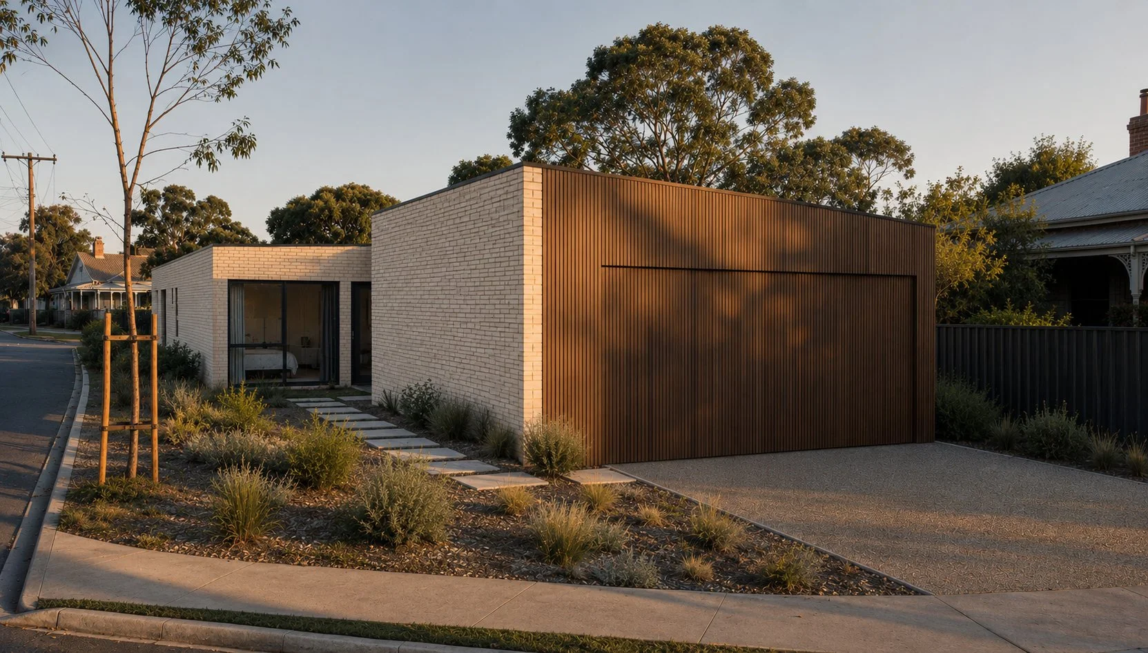
Future Nostalgia: Transforming a Tired Family Home into a Sophisticated Sanctuary.
How a tired Metricon family home received the ultimate interior design Glow-Up.
Utilising the existing layout, expansive use of walnut veneer paneling was used to create the feeling of a truly bespoke, high spec kitchen.
A Metricon Glow-Up
In the early 2000s, Metricon homes were the epitome of family living. These spacious but conservatively designed houses provided flexible living for countless young families so it’s no wonder they dotted the suburbs of Melbourne in abundance. One such dot, a two-story, four-bedroom, three-bathroom off-the-rack home located in leafy Malvern East, had been a beloved haven for two decades. But as the years passed and the children grew up, the home began to show the ravages age at the hands of 3 active kids. It was time for a refresh—one that would reflect the family's journey from the happy chaos of youth to a more refined, adult elegance.
The Client's Vision
The family wanted to breathe new life into their home, transforming it into a sophisticated and stylish space. Tired of the original safe beige palette a more mature and dynamic aesthetic was the goal. Their brief to DMP Creative was simple yet ambitious: create a home that felt grown-up, using colour and texture to inject sophistication whilst maintaining character and warmth.
Initial concept moodbaord. Warm hues and natural textures formed the overall creative direction.
Design Inspiration: Mid-Century Meets 1970’s Eltham
DMP Creative drew inspiration from American mid-century architecture and the distinctive designs of Alistair Knox, a renowned architect known for his work in Eltham during the 1960s and 70s. Knox’s designs were celebrated for their earthy materials and harmony with the natural environment often using expanses of rustic mud brick and reclaimed materials. This approach perfectly aligned with the family’s desire for a home that felt both sophisticated but relaxed enough to host many functions from 18th birthday parties to large family Christmases.
Rough, rustic tiles surround the newly created fireplace designed to invoke the use of hand crafted brick by celebrated architect Alistair Knox.
The Transformation
With the help of Ardele Construction, DMP Creative set out to bring this vision to life by incorporating a rich palette of materials and colors. Key elements of the renovation included:
Warm Walnut Veneer: The extensive use of warm walnut veneer paneling added a sense of minimalist elegance and natural beauty to the home. This material was chosen for its rich, warm hues and was used on mass to create a feeling of refined earthy luxury.
Micro Cement: Micro cement was used to create sleek, contemporary surfaces in most bathrooms that were both durable & visually striking whilst being kind to the wallet. Its smooth, seamless finish provided a modern contrast to the natural textures of the other materials.
Earthy Green Paint Tones: Earthy green tones were employed throughout the home to evoke a sense of calm and connection to nature. These hues complemented the walnut veneer beautifully, creating a cohesive and inviting atmosphere. Pops of rusty red and orange were deployed to add a spicy contrast; a world away from Metricon’s “safety beige”.
Textured Brick Effect Tiles: Textured brick effect tiles were used in the family room to add depth and rustic charm, providing a tactile contrast to the highly refined walnut veneer surfaces. These tiles drew inspiration from Knox’s signature use of mud brick and recycled materials, blending rustic techniques with modern design.
Brushed Brass Accents: Highly refined brushed brass accents were strategically placed to add a touch of luxury and sophistication. These elements provided a polished counterpoint to the earthy materials, ensuring the overall design felt balanced.
Creating Impact with Rich Colours and Furnishings
To stay within budget while achieving maximum impact, DMP Creative used rich colors in both the design and furnishings. Bold, deep hues were chosen for walls whilst key pieces of artwork, decorative accents and furniture pieces also got the colour treatment with tactile but durable materials such as velvet, distressed leather and linen. This approach allows the family to imprint a new history without being precious of the new whilst infusing the home with high impact design vibrancy sans extensive structural changes.
The guest bedroom again uses expanses of walnut paneling to create a concealed wardrobe and entry into the adjoining ensuite.
The end result
The transformation of this early 2000s Metricon home shows how thoughtful design can breathe new life into a tired space without breaking the bank. By embracing rich colors, varied textures, and timeless materials, DMP Creative created a sophisticated, grown-up sanctuary that perfectly reflects the evolution of its residents. This rejuvenated home is now a beautiful, warm, and inviting space that stands as a testament to the family's journey and the power of inspired design.
New Project Tour: Rayner House Prahran
Nestled amidst a neighbourhood of vibrant markets, apartments and commercial buildings, is an urban oasis that’s a world removed from the outside hustle and bustle.
Sofas by James Said. Occasional chair by Space. Coffee tables by Voyager. Pendant by LightCo
Home to a couple and their pooch that lead a busy social lifestyle, the home’s interiors are designed to reflect calm and liveable sophistication. Beyond its unassuming façade, occupants are transported from a lively metropolis to a place where classical European design meets contemporary living which circulates around a central courtyard that can be viewed from the public zones along the ground and first floor.
Table by Poliform. Chairs, buffet and lamps by James Said. Pendant by LightCo. Rug by The Rug Collection
Two, bronze dancing brolgas take centre stage perched above the central water feature and the trickle of running water becomes the soundtrack of peaceful living. Adorned with old world details and modern luxuries, the contemporary revival of this inner-city townhouse celebrates the unity of bilateral worlds to create a centric and charming place for the couple to downsize, just as they had envisioned.
Dancing Brolgas Statue by Willie Wildlife Sculptures
Originally built in 2009, the Georgian style town residence with its symmetry and generous proportions was in need of a rigorous update and lent itself to being the perfect foundation to create a transcontinental home layered with ubiquitous Italian, Parisian and Turkish references which establish the character of the home.
The original home bordered on uncomfortable, heavy drapes paired with deeply coloured wallpaper produced a darkness that proved too overwhelming for clients, Julia and Paul. The challenge was unlocking an interior design style that would honour the original architecture, whilst bringing a lighter, fresher and more liveable quality, weaving in the couple’s passion for travel, antique furniture and family time.
The reception lobby reveals glimpses of the reception room, circulation halls, central and rear courtyards, framed by a classic open double-height staircase. The heart of the house features an elevator that spears through the four levelled home, from the four-car garage, past formal and informal living quarters, a lavishly appointed accommodation zone, to a terrace entertaining retreat complete with steam room, BBQ and heated rooftop pool.
Custom carpet RC+D
High pile rugs, indulgent upholstery, marble tables and brass accents make the front end of the home feel luxuriously relaxed. Each room is elegantly composed with a mature curation of rich textures and quality furnishings that read as one with the surrounding architecture and joinery, balanced by modern artworks that marry past with present.
Soft whites and pale greys maintain the home’s atmospheric opulence while the choice of bolder, earthy hues in the informal family areas offered the balanced living our clients desired. A galley style kitchen links formal and informal zones, encased in premium calacatta marble and professionally appointed with an assemblage of in-built appliances, including coffee maker, steamer, teppanyaki plate and three ovens.
The informal lounge and dining consist of an eclectic colour-wise aesthetic that features a pair of sofas in deep green velvet anchored by hand knotted burnt orange rug, connecting the interior with the tranquil Parisian Garden escape that’s surrounded by vine covered walls and grand peristyles, accessed via French doors. Fabric and furniture selections were selected to be pet and grandchildren friendly to meet the active couple’s practical requirements.
Sofa by Fanuli. Rugs by The Rug Collection. Soft furnishings Fenton&Fenton
The first floor features the master bedroom suites, comprising custom robe joinery and personalised his/her ensuites. Laced in calacatta marble slabs that overlay the black marble which used to make the space feel tight and unwelcoming, Her bathroom design features herringbone wall tiles, floor heating systems and heated towel rails. A brass framed custom-made mirror sits above a navy vanity unit, fitted with golden hardware that adds a touch of glamour and romance. Julia always dreamed of a blue bedroom sanctuary that was quiet and composed; a space to centre herself at each end of the day. A formal yet supple occasional chair has been reupholstered in a feminine blue patterned fabric, complementing the detailed ceramic table lamps and bespoke bedhead designed to match, fulfilling Julia’s aspirations.
Across the hall and through the home office library that looks out over the back garden, Paul's master has a relaxed tone achieved via neutral linen sheets, black accents and a custom bed head that extends the length of the wall behind the bed, softly hugging the space. Cosy but not crowded, we continued to strive for understated elegance by selectively choosing elements that added value and function. Here, as in the second master ensuite, spatial adjustments were necessary to make room for extended wardrobe joinery, spa bath and enclosed shower, also fitted with calacatta marble and floor warming features. A minimalistic mirror and dark timber vanity together create a more masculine zone.
The one additional bedroom with adjoining marble bathroom, and top floor terrace were also redesigned and furnished, keeping in mind the grandchildren aged 3 and 5. Whitewash custom joinery and rich textures continue to develop the soothing ambience, while plush seating adds an extra level of comfort. Colourful artwork and another custom bedhead, this time in patterned red and blue, tailors the space to the two special visitors that come to stay weekly with Nan and Pop.
On the basement level there is a sizeable wine cellar next door to an intimate cinema room. What was before a blank and empty space with no real purpose, is now a well-loved media room, designed to accommodate every movie viewing or important sports match with a full surround sound system, acoustic engineered natural timber panelled walls, decadent carpet and velvet drapes, adjustable mood lighting, heating and cooling system and all important self-serve mini bar that’s always stocked with snacks and refreshments.
Velvet drapes by Interdrape. Sofas by King Living. Joinery by Alt Constructions
A joint design collaboration with Patricia Davila of Noise Design, we found that challenging each other and sharing complementary strengths made for an object lesson in finesse and good editing. Our holistic approach encompassed the entire house, seeking elements that offered a sense of cohesion, such as silk custom-made curtains and linen sheer fabrics that now dress every window, allowing the smaller details to distinguish each room’s character. New chevron laid timber flooring in the formal spaces adds to the classical persona, while the bedrooms’ custom carpet has a lush finish that is warm and inviting.
Design and styling: DMP Creative/Noise Design
Builder: Alt Constructions
Photography: Nicole England
New Project: Pop Art House, Blairgowrie
Having a passion for mid-century furniture and an impressive collection of Charles Blackman artwork, client’s Denis and Jura were hoping to incorporate city-slicker art gallery sensibilities into a reimagined coastal interior that reflected the surrounding environment to add warmth, personality and a more contemporary aesthetic.
When I first visited Blairgowrie House, I was surprised by what a nice property it already was.
A modern building with minimalist design principals, expanses of glass and stepped down a sloping block. Nestled amongst ti-trees synonymous with the Mornington Peninsula, it was a far cry from the classic beach shack I was living in just around the corner.
Despite this, Blairgowrie House had a grown a little tired in areas and also harboured a fairly large design problem that needed resolving. The open plan living, dining and kitchen area was on a civic-sized scale. Further exasperated by soaring ceilings, the space was so large it dwarfed any human resident (let alone poor Muppet, the resident pooch) and made cosy, intimate living impossible. Especially on those cold wintery coastal evenings.
Having a passion for mid-century furniture and an impressive collection of Charles Blackman artwork, clients Denis and Jura were hoping to incorporate city-slicker art gallery sensibilities into a reimagined coastal interior that reflected the surrounding environment to add warmth, personality and a more contemporary aesthetic. Installing a new fireplace was also an absolute client must have. No arguments from me here!
The first point of business was dividing up the space to create more specific living hubs without destroying the open plan feel. Creating a fully bespoke fireplace and integrated entertainment unit solved 2 problems at once dividing the giant space and providing a discrete place for the TV previously mounted mystifyingly high on a feature wood panel wall. Deceptively simple, the fire place structure hides a complex construction that challenged the trades involved. Polished concrete and Paloma brick tiles are encased in a perfectly imperfect patina treated steel shroud. The TV is veiled behind custom designed black wedge veneer bifold doors that recess completely out of view within the structure ensuring the design is maintained if the TV is exposed and in use or hidden away. The crowning jewel is the double sided Oblica fire box that is part sculpture, part function.
Opposing the fire place is a large feature wall clad in Japanese charred timber which forms a dramatic backdrop for the larger Blackman artwork. Drop track lighting was added to “lower” the ceiling height and bring a little art gallery glamour to the space.
Beyond is the dining and kitchen areas. A large Alex Earl pendant above the dining table also features a patina finish to add cohesion between the newly divided spaces. Black wedge cabinetry replaced the tired and very predictable light wood that is so ubiquitous in coastal inspired interior design. The additional joinery under the island bench overhang features an in-built tech station to hide life’s ugly but essential tools such as phones, iPads and endless charging cables. The marble bench tops were also replaced with a strikingly dramatic Neolith calacatta gold. On this last note I do confess this was all the client’s doing. In an unusual twist it was the client encouraging the designer to be bold and I must say they were on the money with the stone selection. It looks sensational.
The thing I loved most about this project was the collaborative nature. Having plenty of experience redoing shop fit outs, Denis and Jura also posses a passion for renovating and design. Ideas were bounced around freely by all parties. With absence of ego all-round, if it was a good idea it got developed regardless of whose it was. For me, this is how design should be. It’s this experience, passion and sense of adventure that also enabled some of the most spectacular elements of the design to come to life. As mentioned, the fire place unit is 100% bespoke which meant some elements were being done for the first time by some very experienced trades. In other words, the outcome wasn’t assured which can be nerve wracking but as this project proves, very very rewarding.


Style Like A Pro: The bed
How do you style your own insta worthy bed and bedroom? Here’s some professional tips and tricks.
Layering colours and textures
My lack of discipline boarders on the pathological. There, I said it. This is a fact verified by my local Crossfit gym (sorry guys, I promise I’ll see you soon) and my local wine shop (sorry guys, I promise I’ll stop bothering you…one day). But in the broad litany of self imposed rules that get regularly broken, there is one that remains like a shining beacon of sanctimonious smugness.
I make my bed. Everyday. Ok fine, 363 days a year. The other 2 days are those in which I feel too mean spirited to dislodge my peacefully slumbering cat. Every morning I not only make the bed, I style and plump and fluff as though a photoshoot were about to happen. For me, this sets the tone for the day and my mindset. No matter what potential bin fires to threaten my zen, at least I’ve made the bed #adulting. If afore mentioned bin fires escalate to full blown crises, there’s always the luxury and embracing comfort that is crawling into a beautiful bed after a crap day….with wine. And chocolate. And the Cat. I digress.
So, how do you style your own insta worthy boudoir? Here’s how:
You’ll need:
2 European pillows
4 Standard pillows (2 will be “sleeping” pillows)
1 doona (more on doona’s later)
1 plain sheet set and doona cover set
2 Euro pillow cases
1 or 2 scatter cushions
1 throw or quilt/comforter
Sounds like a lot but once it’s all in place it certainly won’t look like that. Choose high loft/high profile options as you want billowy goodness. Buy the best quality you can afford, unfortunately the tantalisingly cheap bedding isn’t great. And that’s not me being a bougie stylist either. Both from a function and design perspective they perform terribly…and terrible performance in the bedroom should always be avoided.
Choosing colours:
Mixing and matching colours can be hit and miss, even for us pros. To ensure a hit, pick out a few colours from an artwork or if you’re using a doona cover with patterns, select 1 colour from the pattern and use it for the sheets and another colour or 2 for the scatter cushions, euro pillow cases and throw. Voila, design cohesion.
Texture:
You don’t have to use lots of colours, or any in fact. Simple white or monochrome is still super fabulous but bring it to life with a combo of textures. Think, smooth cotton sheets, chunky knit throws and tactile velvet.
Assembly:
First up? The sheet set which is is pretty straight forward.
Second, the doona and throws. I usually go one of two ways here. If I’m using a throw, I’ll lay the doona on the bed, position the throw towards the end (but not all the way) then fold the top of the doona back to the foot of the bed (over the throw) and then back again to the top of the now folded doona…kinda like a “Z”. If I’m using a quilt or comforter, I will lay that down on the bed first and fold to the top about 1/3 down, then fold the doona two or three times and lay that at the foot of the bed (you can fold this in a way so when you get into bed, you can just grab the top and pull up rather than going to the hassle of unfolding then laying it back on the bed….basically, another Z fold).
Finally:
The pillows. The standard pillows you use for the basic pillow cases in your sheet set are your “sleeping” pillows (if you use some fancy ergonomic bamboo pillow as seen on TV? Put that in the wardrobe….nobody got time for that). You want to hide the sleeping pillows a little bit as they tend to get a bit messed up. My go-to pillow combo is euros sitting fluffed and upright up the back, the “sleeping pillows” then the decorative standard pillows (rocking the pillow cases that came with your doona set) up front and showing off. Either stack the standard pillows on top of each other or prop them up like a filing cabinet. I NEVER have pillows sitting on the doona, they sit on the sheets. Dunno why but to me, it looks a bit boring and you loose some of that puff we’re trying to infuse in the final look. Give the scatter cushion/s a puff up and place in the centre in front of your pillow stack. if using down cushion inserts don’t forget the chop…it can be quite satisfying on a Monday morning…
And you’re done! I know it sounds like a lot of bother but really, after the first couple of makes, the bed sorta starts making it myself. For me, this entire process at home in the morning takes maybe 5 minutes? No lie.
The doona: Further on doonas as they’re important. The high loft doonas are the best with goose and duck down considered the gold standard….and they’re lovely. But, unless you’re sure the down is ethically sourced avoid them. You don’t even wanna know what happens to the poor feathery guys supplying the filler and who wants to sleep under all that bad karma? I love micro fibre down guilts. They’re luxe, puffy, warm AND cruelty free. If you have a “hot” partner, a good solution is using 2 doonas with different warmth ratings. Put each in a different cover and use one in place of a throw. or comforter This is also a great solution for summer when you don’t need the warmth but still want that high loft effect.
The haters: For reals. Lots of people get mystifyingly fussy about using lots of pillows on beds (and couches). Sadly, the shade is likely to come from a source surprisingly close to home by way of your significant other. “Why do we need so many pillows, we only have one head, wah wah wah.” Whatevs. I say do your thing until they can pack the dishwasher properly…
Happy styling, Peeps!
Dave xx
The Art Of Giving, Made Easy
A beautifully wrapped gift is one of life’s delights.
Beautiful gifting, made easy.
It’s something we all love and appreciate. Yet somewhere along the way this societal ritual has become a bit lack lustre. I’m talking about gift giving.
Before I continue, I will confess that I too have been found guilty on many occasions of hurriedly grabbing a gift card from the servo on the way to a birthday dinner. Justifying it as “but this way they can get what they want”. No. Not really. It’s lazy and vaguely disrespectful. There, I said it and I’m sure with some soul searching you’ll agree too.
A beautifully wrapped gift is one of life’s el-primo delights. So much so that there’s a gazillion you tube videos unwrapping and unboxing luxury packages that we devour by proxy in a strange voyeuristic ritual to scratch an itch via an empty facsimile of the real experience. And it doesn’t really seem to matter what the actual gift is, it’s the excitement and delight of finding out that’s the fun. Not mention that little warm glow you get knowing someone cares enough about you to go the trouble and effort to wrap it, just for you. You could literally gift me a used vacuum bag and I’d love it a much as a Louis Vuitton wallet if it was wrapped to perfection....the former gift idea is not recommended, however. The latter, yes please. Hint hint.
All that said, I don’t think not caring is the issue This crazy busy, non-stop digital world is the prime suspect. We just have so much on our minds, so many things to do that thinking about what to get, buying it, wrapping it and finding the time to give it in person is one thing too many on the daily to-do list. Sadly just getting it done is the name of the game in the 21st Century and gift giving is not immune. Of course you can buy stuff online and select “gift wrap” and move on with your life but you never know just what the final product will look like.
When designing the products for my online store, the packaging was considered at the same time. It was important for me to offer that beautiful experience as an integral part of the product experience whether it was a gift or not. Every product comes beautifully packaged and ready to gift - as is. But for me, it wasn’t enough for the product to be beautifully presented only to be let down by the harsh utilitarian reality that is postage. Because let’s face it, we still need to buy something quickly online and ship it direct to the receiver. But why should the “gifting” experience be sacrificed? This is why my experience begins with the actual postage box. From start to finish, I wanted a luxurious, exciting experience. From the customer feedback I’ve received? Mission accomplished!
Next time you need to show someone you care (and yes, you should include yourself in that category), swing by my website and take a look. With an option for handwritten messages at checkout, trust that my OCD vis-à-vis presentation has your back and your gift receiver will be delighted and forever full of gratitude…Plus, you’ve just up upped the stakes for your own birthday. What? There’s nothing wrong with taking out a bit of gifting insurance…
I’m currently working on site functionality to offer physical gift cards boxed and shipped, but for now, digital gift cards are available and a perfect option for those someones in your life who have everything. Digital gift vouchers can be used for any product in the store….or, wait for it…DESIGN SERVICE!! Mmmm hmmmm, that’s right. Your gift can be put towards a design consult meaning you also gain bragging rights for your love one’s new and stunningly beautiful lounge room…But remember it’s not about you (but really, it is).
If you know someone in your life who could do with a little help in the gifting department, share this blog with them as a gentle hint.
Until next time peeps, happy gifting!
Dave xx
Style Like A Pro: The coffee table
A well styled coffee table is a marvellous thing. And an absolute essential in the interior decorating caper.
A well styled coffee table is a marvellous thing. And an absolute essential in the interior decorating caper. We’ve all seen those stunning coffee tables in magazines, maximalist masterpieces literally groaning with a rich bounty of gorgeous little things.
But wait, there’s no room for anything else…like my wine. Extremely limited studies show* that if you have to sit and hold onto your glass whilst binge watching Netflix you drink 2-3 times more.
* me. at home. alone. don’t judge.
The good news is, it’s pretty easy to combine beautiful style AND functionality in this area. And I really don’t get to say that often. Here’s how to create your dream coffee table:
1) Layout: When I’m putting together a vignette (fancy designer term for putting stuff on a table), I usually will start with the shape of the coffee table itself. If it’s square, I layout items to fill a square foot print. Rectangle table, a rectangle foot print. Round? Anything goes! I usually then pick a large book and build from there. Adding a decorative tray, magazines and a trinket box (more on this later) leaving gaps for other items like candles and vases….It’s like a glamorous game of tetras…
2) Height: Height is very important. Whilst a mix of high and low items is essential, anything too high and it will just get in the way of conversation or (most importantly) the TV. I generally won’t go much higher than 30-40 centimetres, including floral arrangements. To achieve different heights, a really simple way is adding another coffee table book or magazine to the pile.
3) Layering: Now you have your general layout, what ties it all together is the sprinkling objet d’art or layering. Little glass bowls full of sweets, small sculptures, a scented candle (a must in my household) and of course a vase of flowers or a small plant can be nestled in around things. There’s really no rule here, just be prepared to have a play to see what works. If you get really stuck, grouping items into 3’s is a go-to design rule.
I mentioned a trinket box earlier? A decorative box is essential for a coffee table. You’ve spent all this time creating a masterpiece only to have your significant other dump car keys and a fist full of change slap bang in the middle of your fabulous styling moment. A decorative box is the answer to store all those ugly bits and bobs associated with real life along with the inevitable wood pile of remote controls we all seem to have these days.
Still a bit unsure? All of my homewares have been selected to work within this very framework, so creating your own coffee table masterpiece is super easy. Of course, if you need some advice I’m always here to help! Now, get to styling and remember to tag me on insta (_dmpcreative) or use the hashtag #dmpcreativeinteriors so I can check out and share your handy work!
Happy styling Peeps!
Dave xx
Colour me happy. Daring to be different with paint colour.
How to choose wall colour with confidence.
Colour me happy.
Choosing paint colours with confidence.
Lately I’ve been looking at ways to steer clients away from safe colour palates and into something more adventurous. This is usually greeted with some trepidation and I get that, I really do….especially when talking wall colour.
There’s a lot of “rules” around this. Don’t use dark colours in a small rooms, it will make it look smaller. Play it safe for open living areas and stick with a light neutral so it’s not too overwhelming or clashes bla bla. No wonder people get spooked and yes, some are certainly valid.
The thing is though, paint is a relatively cheap thing in the grand scheme of renovating and is one of those elements that makes a HUGE impact on the final result. I’m not sure why people don’t mix it up and change this more often as it’s one part of decorating you can easily do yourself without the expense of a trade professional.
One of things I’m really loving at the moment is using multiple shades of the one colour. This is proving to be quite the hit with my more nervous clients. Doing a feature wall in the darkest shade and then the other walls in a lighter version delivers the drama and excitement without the full commitment. I guess it harks back to the bold feature wall of the 90’s. The difference here, the other shades help temper that impact rather than having a feature wall stand boldly (and garishly) on it’s own as the rest of the room cringes away.
A good place to start choosing the colours is to look for a main colour, and then grabbing the 2 shades on either side. Taubmans paint samples are great for this as they have 3-4 variants of the one colour on the one sample chip. You can see straight up how they sit together. I would probably not do the darkest and lightest together. Darkest and middle. Or middle and lightest. Basically, you don’t the difference to be too severe and jarring. Make sense?
The next step is getting sample pots of all 3 and start painting! Make sure you do a larger sample (say 50x50cm square) and do that in various points in the room to see how the colour reacts to ambient and natural light. You’d be amazed how the colour can change from one part of the room to the next, from one time of day to the next. It’s also important to remember, the existing wall colour will influence the new paint samples so a couple of coats and waiting for it to dry is best before deciding. If that all sounds too hard, Dulux have A4 sized paint samples you can blu-tac to the walls which is super easy and quick.
Now you’ve made the decision, go forth and create your dream space!
Check out my insta feed to see some experiments in colour and materials…and hopefully some inspiration!
Dave xx
Turning that interior design problem into an opportunity!
Whilst all of us would love to rip everything out and start again with a cache of high-end designer knick-knacks, more often than not it’s not just not possible. It’s at this point many people give up. But it doesn’t have to be this way!
Beginning a property make over can seem a bit daunting. Where do you start…more importantly where do you stop?
Whilst all of us would love to rip everything out and start again with a cache of high-end finishes and designer knick-knacks, more often than not that is not possible. It’s at this point many people give up. But it doesn’t have to be all or nothing to get great results.
Refreshing a Docklands crash pad for a country based client recently, this very dilemma was front and centre. The apartment itself was built in the early 2000’s without a single update during that period and was beyond tired. Think 90’s Australian boy band video clip…but I digress. Without the budget, a new kitchen, new bathrooms and new flooring wasn’t an option. It is a holiday home after all.
Fortunately, the carpet was in good knick but not exactly a forecast colour trend. Similarly with the window furnishings. Not bad enough to replace, but not up-to-the minute fashion either. Making the best of what we had was simply how this was going to have to work.
This may seem like a huge compromise. In fact it was the opposite. These constraints became the basis of the colour palate and the launching pad for the whole design concept. Using forest greens, leather, linen, stone and dark wood, the concept was to bring rugged, rural Victoria to Melbourne and give it a chic city-slicker makeover. Add some carefully curated decorator and new light fixtures to the dated kitchen and bathrooms (along with a much needed deep clean) and voila! What was once a problem was now a considered colour and design, transforming the space from the post long term tenanted apocalypse it was at the beginning of the refresh.
My point? It boils down to glass half full vs glass half empty. A problem vs an opportunity… plus a handful of other self-help metaphors you can choose from. Anywho, don’t be so quick to think “this is all too hard” and just give up. More often than not, a little bit of creative thinking can make any space an aspirational masterpiece…without inviting financial ruin. Life is too short to live in a space that brings you down!
Of course, if you’re really stuck this is where we can help! A consultation can be anything from the full enchilada or just a friendly nudge in the right direction :)
Dave
xx