

Dromana Renovation: Turning a “Pizza Hut on the Hill” Into a Coastal Heavyweight
A full-scale coastal renovation designed to balance relaxed living with high-performing holiday rental appeal, set high above the Mornington Peninsula
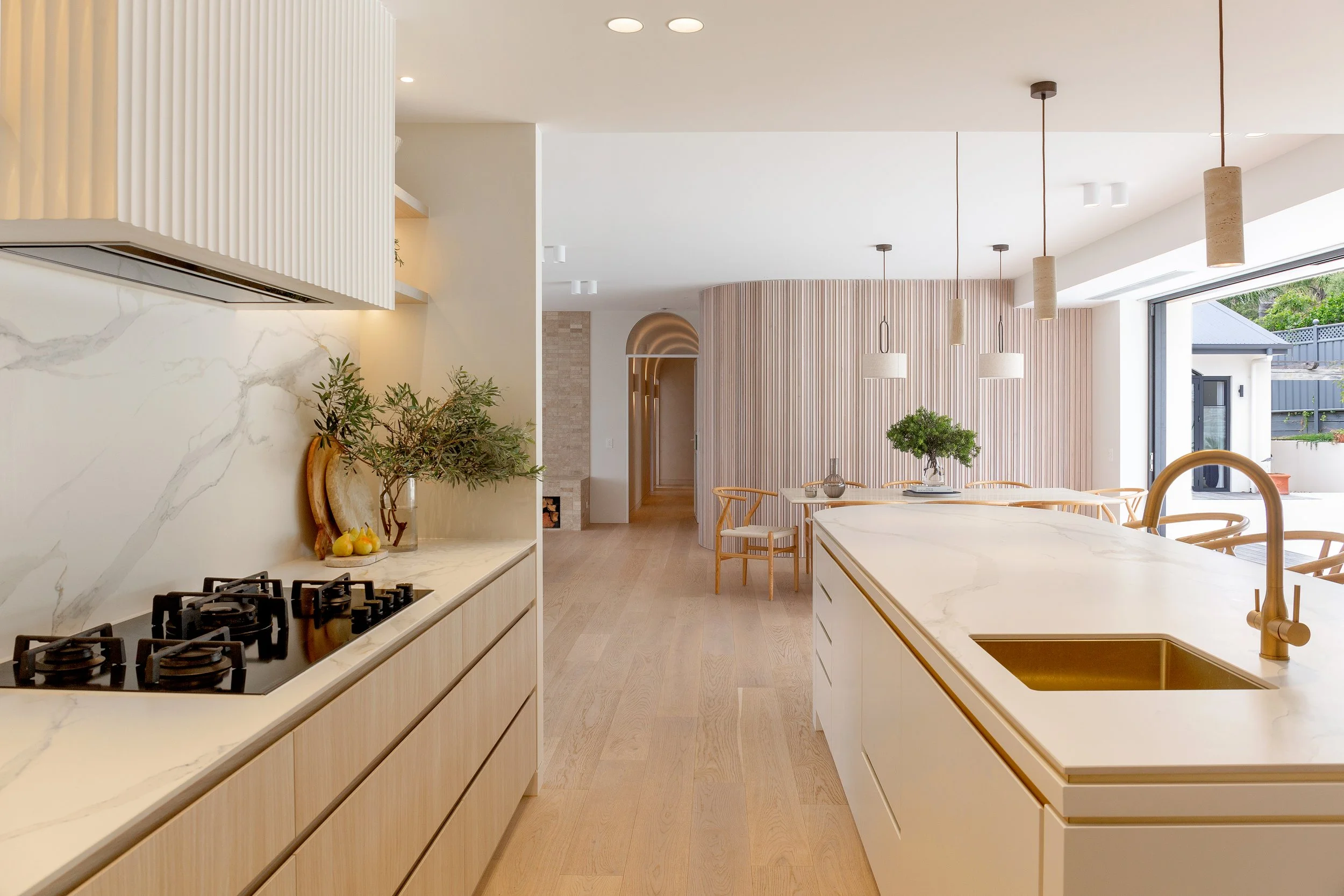
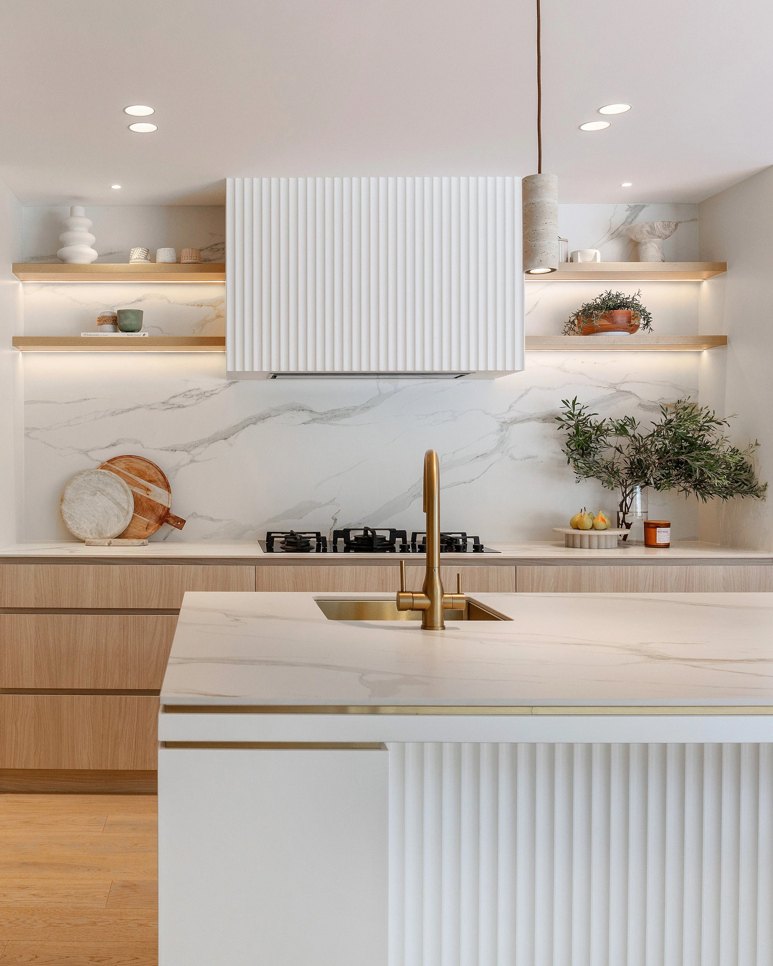
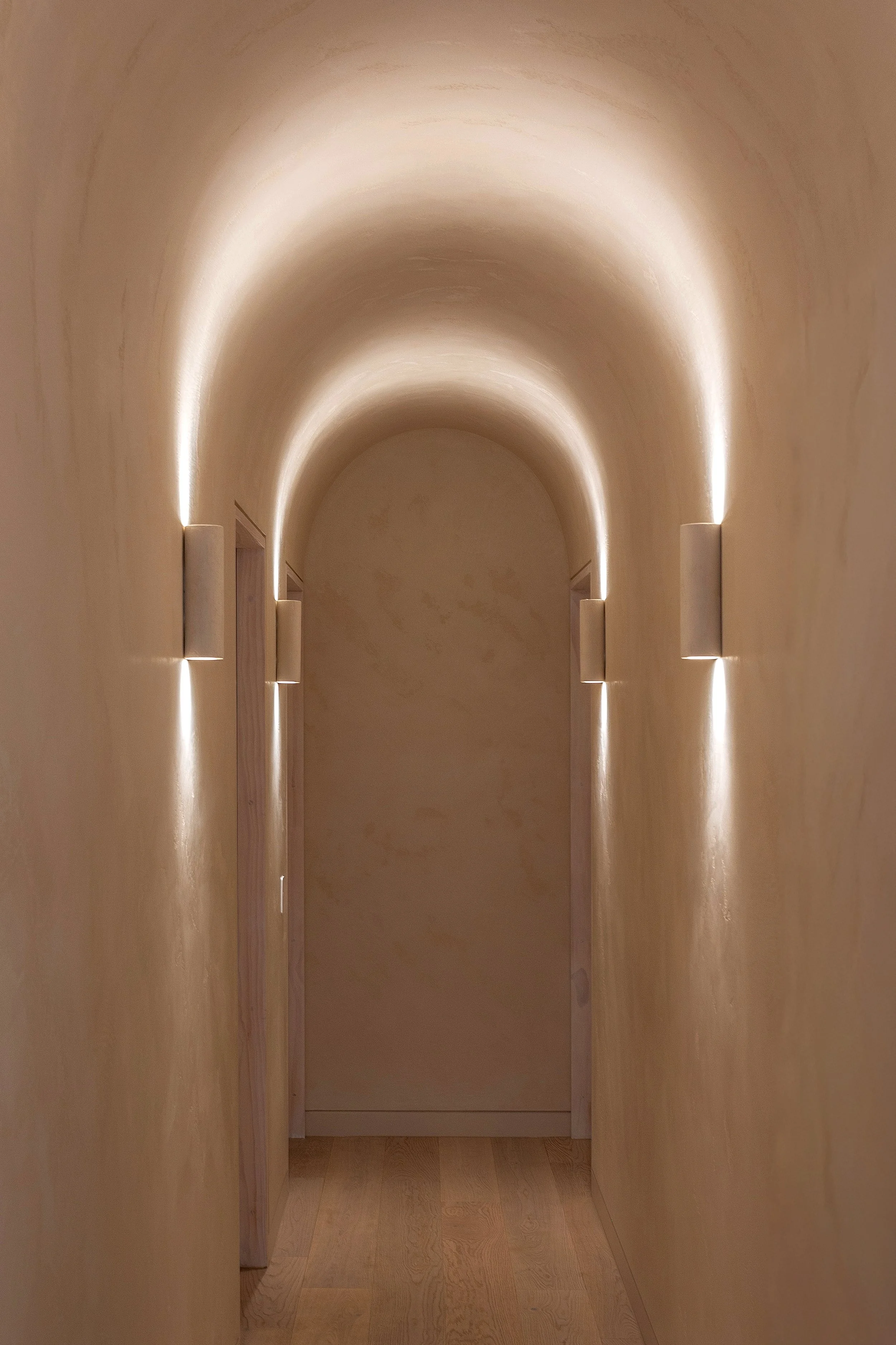
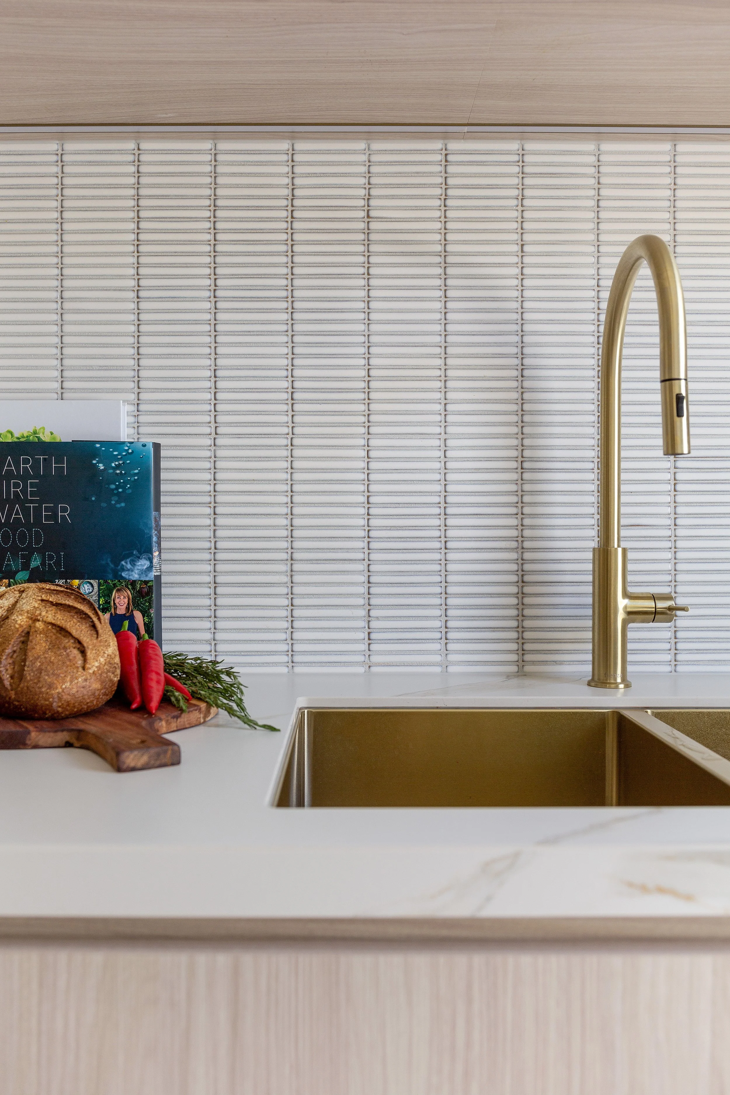
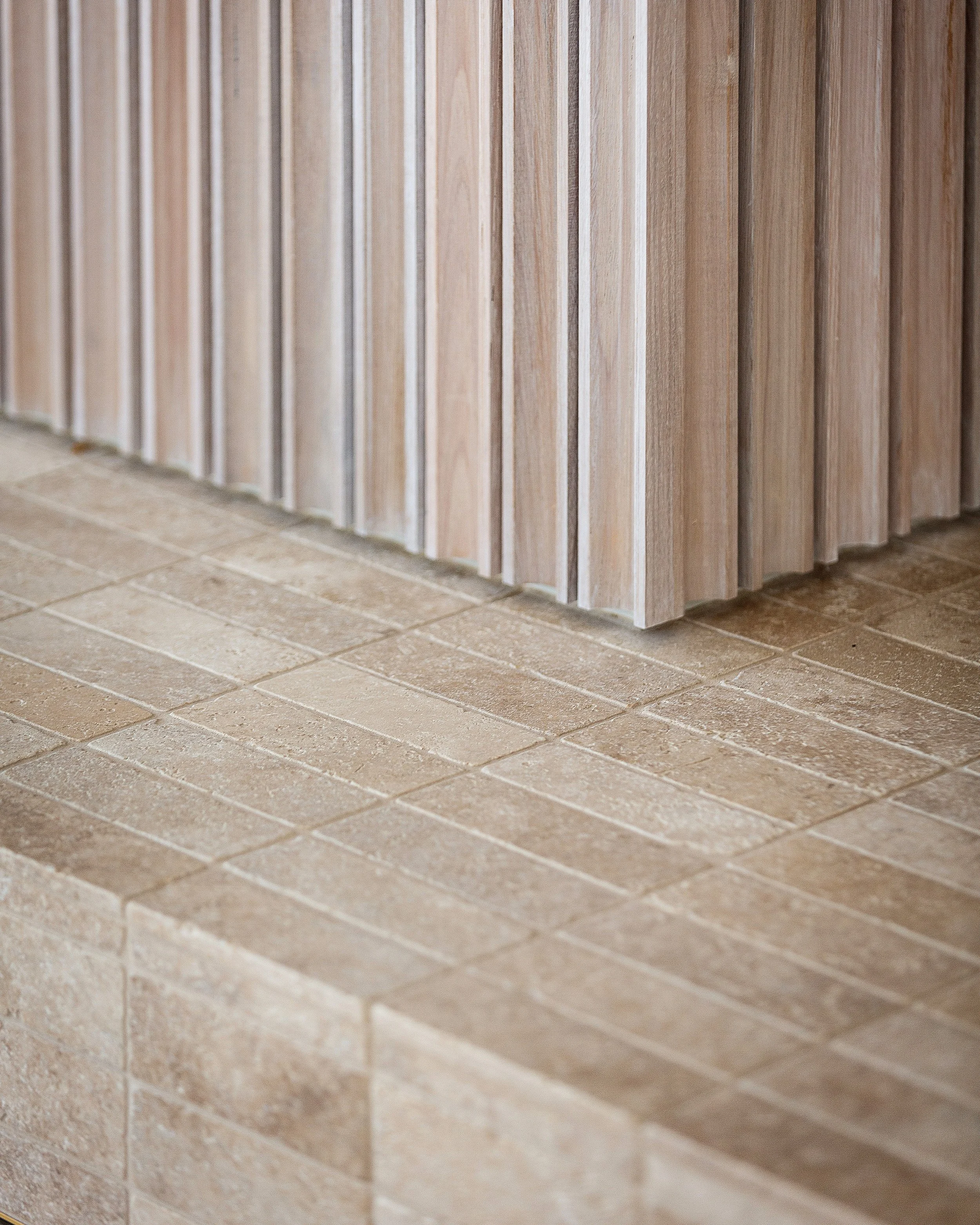
The kitchen and dining zone settles into a calm, tonal palette of timber and stone, where soft curves and vertical detailing gently draw the eye through to the arched hallway beyond. It’s a space that feels both considered and effortless, balancing everyday functionality with a quieter, more sculptural presence.
Some projects are straightforward. Clean brief, clear direction, everyone nods along and off you go.
This was not one of them.
Set high on the hill in Dromana, the house had presence. You couldn’t miss it. Which, depending on how you looked at it, was either a great starting point… or something we’d need to gently dial back.
Not always known for my tact, my initial thought was: Pizza Hut on the hill.
Did I say that out loud?
Yes. Yes I did.
In my defence, the roofline was doing a very convincing 1980s Pizza Hut / Smorgy’s impersonation (and taking me back to happy days childhood memories). But, underneath the all you can eat vibes, there was something really worth working with. Good bones, incredible views, and enough going on to make it interesting once we stripped things back and rethought how it all came together.
The brief didn’t exactly simplify things. It needed to feel like a beautiful, relaxed home, while also performing as a high-end holiday rental. And it had to do both without tipping too far in either direction. Not overly styled, not overly practical. Just… balanced.
Which is where things get a bit “nuanced”.
The layout, thankfully, wasn’t the problem. At its core, it actually made a lot of sense. The central living, dining and kitchen zone stayed largely as it was, anchored by a separate bedroom wing that already worked well. From there, things opened up. Additional accommodation was introduced, and spaces were reworked to include the kind of amenities you’d expect at this level. It became less about reinventing the house, and more about expanding and refining it into something that could comfortably do more.
Which then brings you to the real question. How do you make a space memorable without tipping it into that over-designed, slightly exhausting “coastal” territory that a lot of holiday homes fall into? You know the type. Looks great in photos. Slightly hard work to actually be in.
So the approach was to keep the foundation calm and let the interest build more quietly. Materials with texture rather than pattern. Putting a of a thrill into smaller or unexpected spaces. Enough happening that you notice it, but not so much that it demands your attention.

There was also this underlying idea of the house working a little like a boutique hotel. Not in a uniform, copy-paste way, but in how it functions. Four bedrooms, each with its own ensuite, each with its own personality, but all clearly connected. Like siblings who’ve gone in different directions but still share the same DNA. It sounds simple, but that balance between individuality and cohesion is where things can unravel quickly if you’re not paying attention.
Then there’s the less glamorous side of it all. Holiday homes get used. Properly used. Bags dragged across floors, sandy feet, someone inevitably testing the limits of red wine on a light surface. Everything needed to be durable, but not feel commercial. That middle ground is where the good decisions sit. Warm timbers to soften things. Finishes that age well rather than date quickly. Lighting that quietly does a lot of heavy lifting without announcing itself…and makes you look much nicer than you usually do. A holiday glow, litterally.
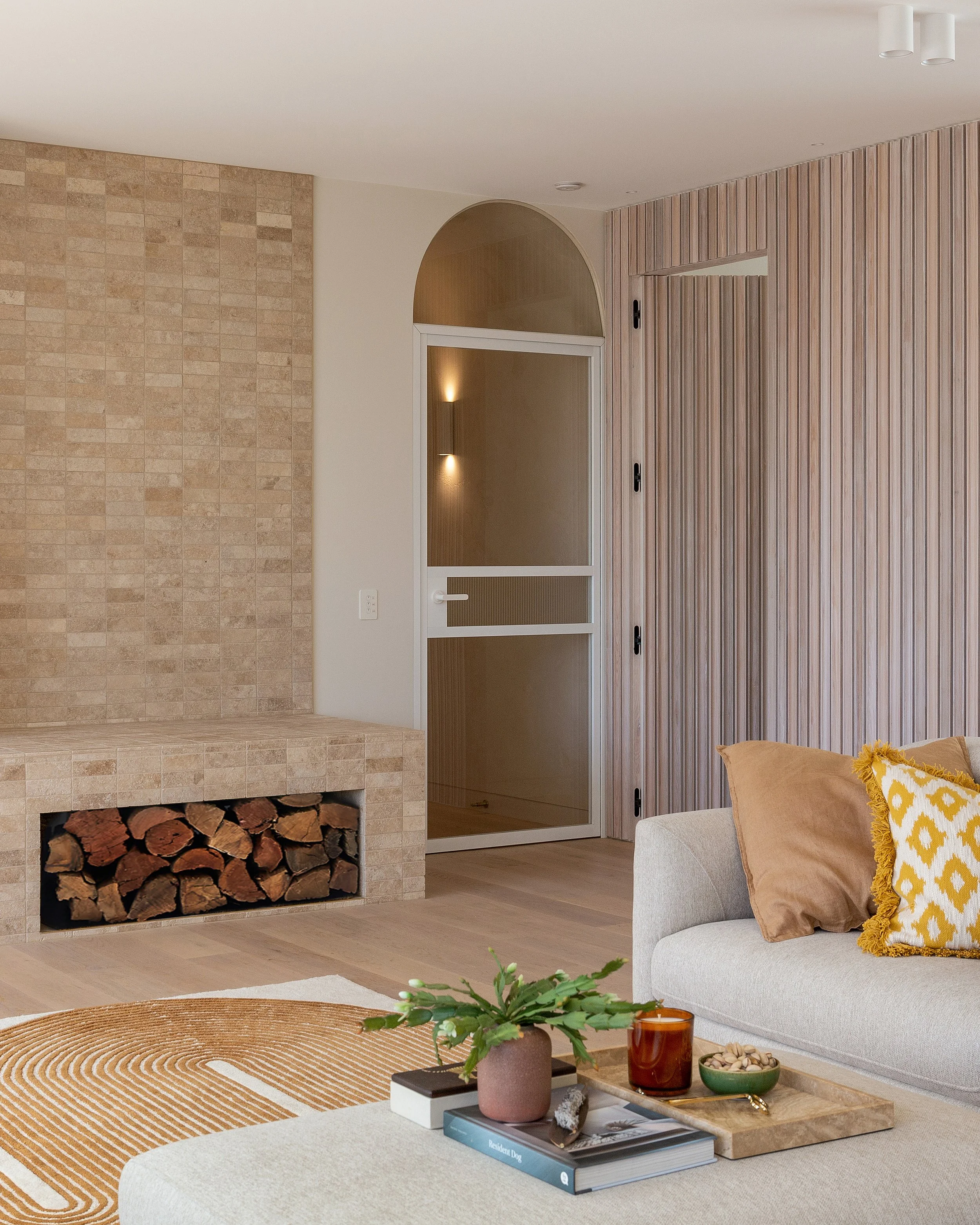
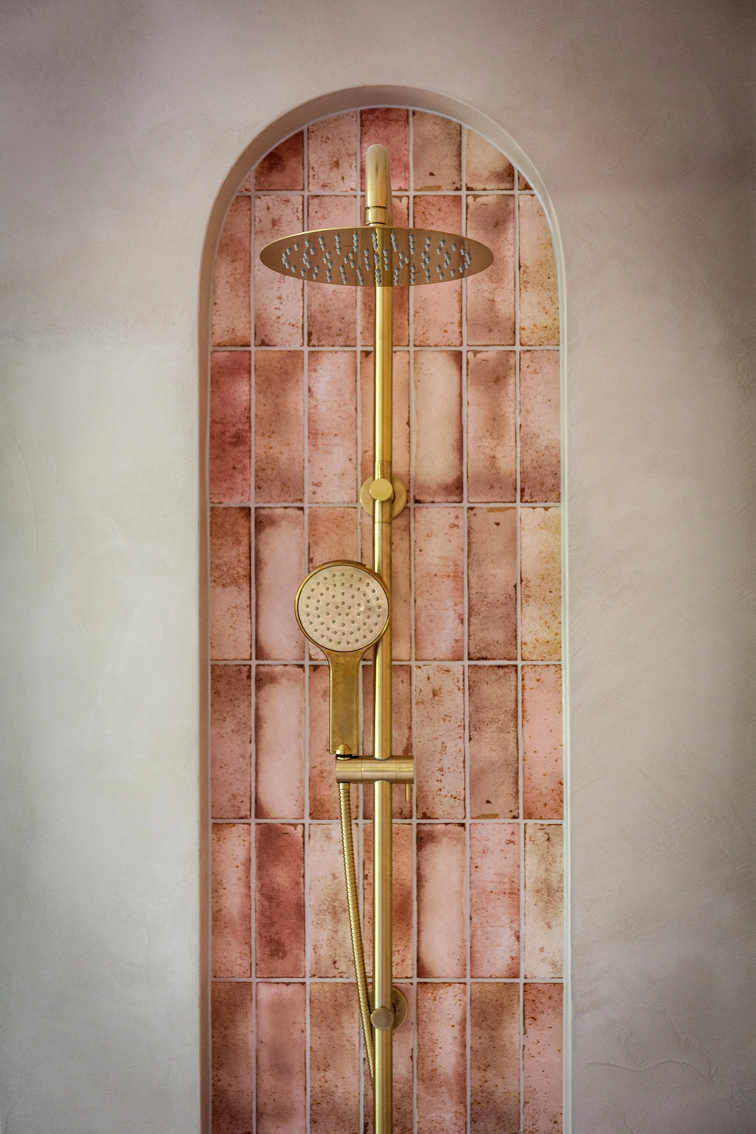
Of course, restraint only goes so far. There are moments in this house that push a little harder. Not loud, not showy, just confident. Existing arch motif was kept and given more presence. Certain materials were allowed to stand out instead of blending politely into the background. Those are the moments that shift a space from being simply “nice” to something that actually sticks.
Behind all of it sits the part no one really talks about. Making sure it actually works. That the design holds together in real life, not just on paper, and that decisions are resolved before they quietly turn into problems later.
And if the brief is essentially “mini hotel, but make it comfortable”, then that thinking has to extend beyond what you see. Things like lockable storage for owners, proper heating and cooling, and laundry facilities that go a bit further than the usual token setup all come into play. It’s the behind-the-scenes stuff that no one notices when it’s done well, but immediately feels off when it’s not.
What came out the other side is a home that feels easy, but works hard. It holds together as a cohesive space, stands up to real use, and manages to feel considered without feeling overworked. And also deluxe as all get out.
Which, when you think about it, is kind of the point.
And if you’re renovating in Dromana or anywhere across the Mornington Peninsula, the brief is usually some version of the same thing. Make it look good. Make it make sense. Make it worth it.
If you’re curious how this one came together in a bit more detail, the full case study dives deeper into the design, with comprehensive galleries, project info, and a few before and after moments that tell the story properly.
Get that balance right, and everything else tends to fall into place