

Playing the long game.
From render to reality. The magic of wholistic design from day one.
Styling a multi-residential project from first render to resident handover
Most projects expect styling to adapt to whatever already exists.
This one was different. From the first marketing renders onward, the same visual language was carried through sales, construction and resident handover, so what buyers were sold early on genuinely reflected what they moved into later.
I was brought onto this development right at the beginning to style and art direct the 3D renders used for early marketing (yes, a digital stylist is actually a real thing. How wonderfully futuristic). At that stage, the building technically didn’t exist yet, but it’s soul very much did and those renders went on to live for years, shaping buyer expectations and sales conversations long before anyone could walk through the front door.
From there, the role expanded. What started as digital styling turned into furnishing and styling the sales gallery and display suite, a full-scale prototype display apartment, and eventually the completed building’s lobby, resident lounges and shared spaces at handover.
Same project. Same visual language. Years apart. No pressure.
Styling for longevity, not trends
Multi-residential projects move at their own pace…Glacial. Trends, on the other hand, move very irritatingly quickly and wait for no-one let alone developers and builders.
The brief here wasn’t to chase whatever was popular that year. It was to create a styling and furniture concept that would still feel relevant by the time residents moved in, and ideally for many years after that.
The approach leaned into natural materials, restrained colour palettes and layered textures that age well rather than shout for attention. The goal was never to be flashy. It was to be calm, resolved and quietly confident. The kind of spaces that still feel good to live with long after the marketing banners come down.
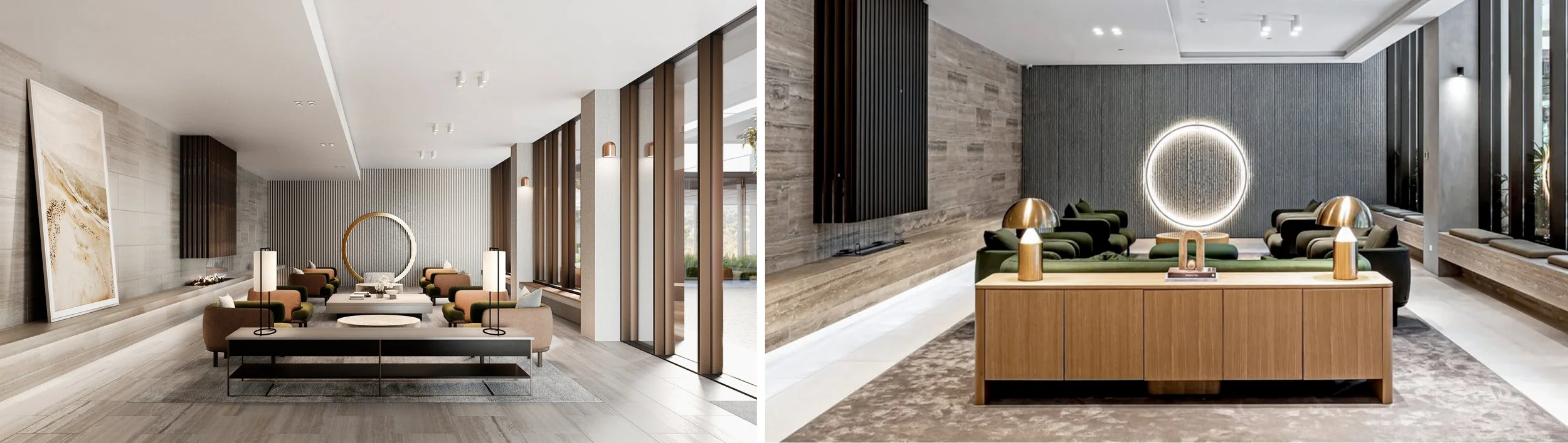
From renders to real life: Sales gallery & display apartments
The sales environments had a big job to do. They needed to communicate aspiration, but also feel believable. Polished and highly desirable, yes. Untouchable and unachievable, no.
Furniture, art and lighting were curated to help buyers understand scale, flow and atmosphere, rather than overwhelm them with statement pieces competing for attention. The display apartment then translated that same thinking into a lived context, showing how the spaces could realistically function day to day and importantly the level of craftmanship to expect.
Nothing here was treated as throwaway marketing fluff. Every decision was made knowing that this visual story would eventually have to stand up in real life, not just under flattering lighting and a hard to resist sales professionals handing you a glass of free bubbly.
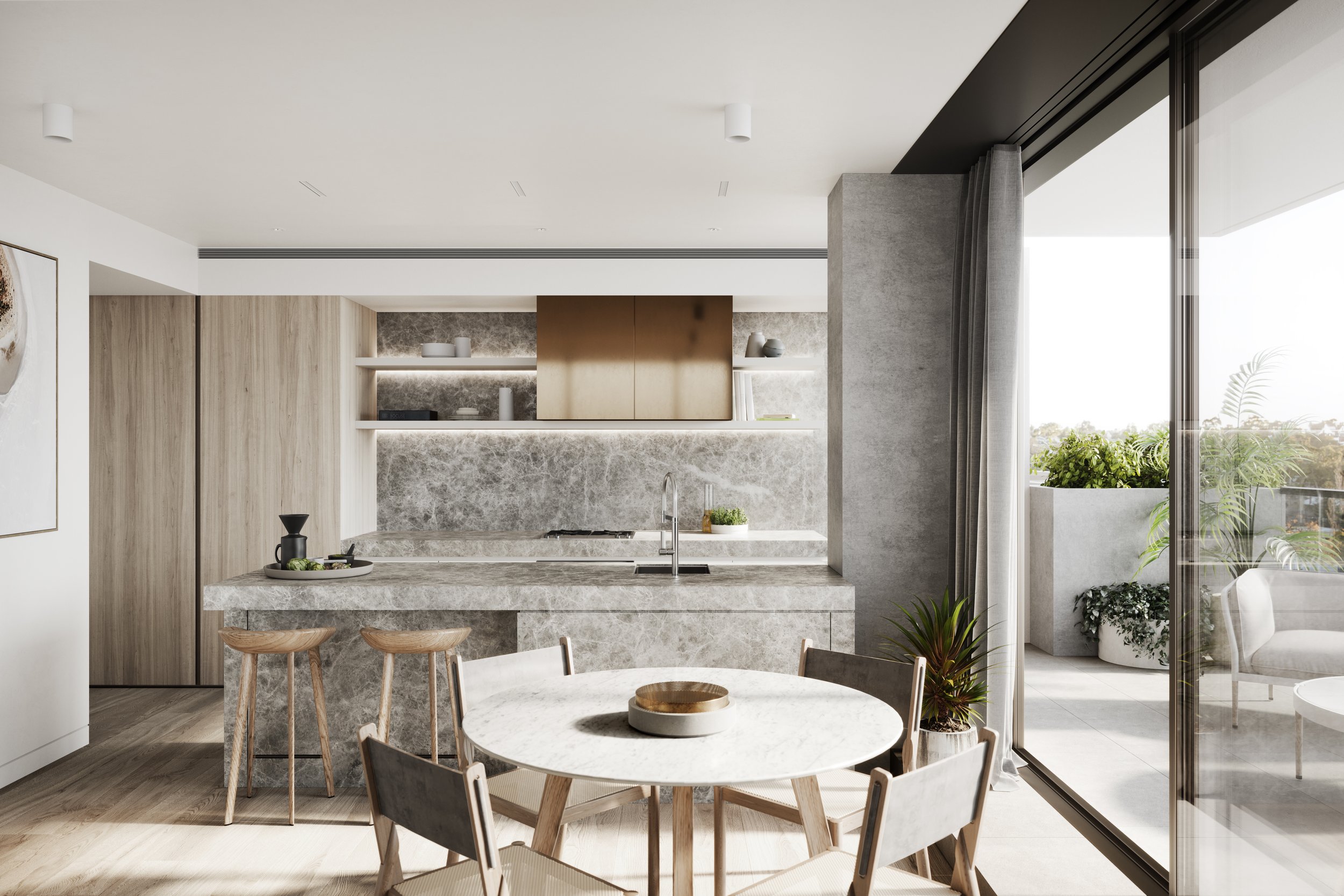
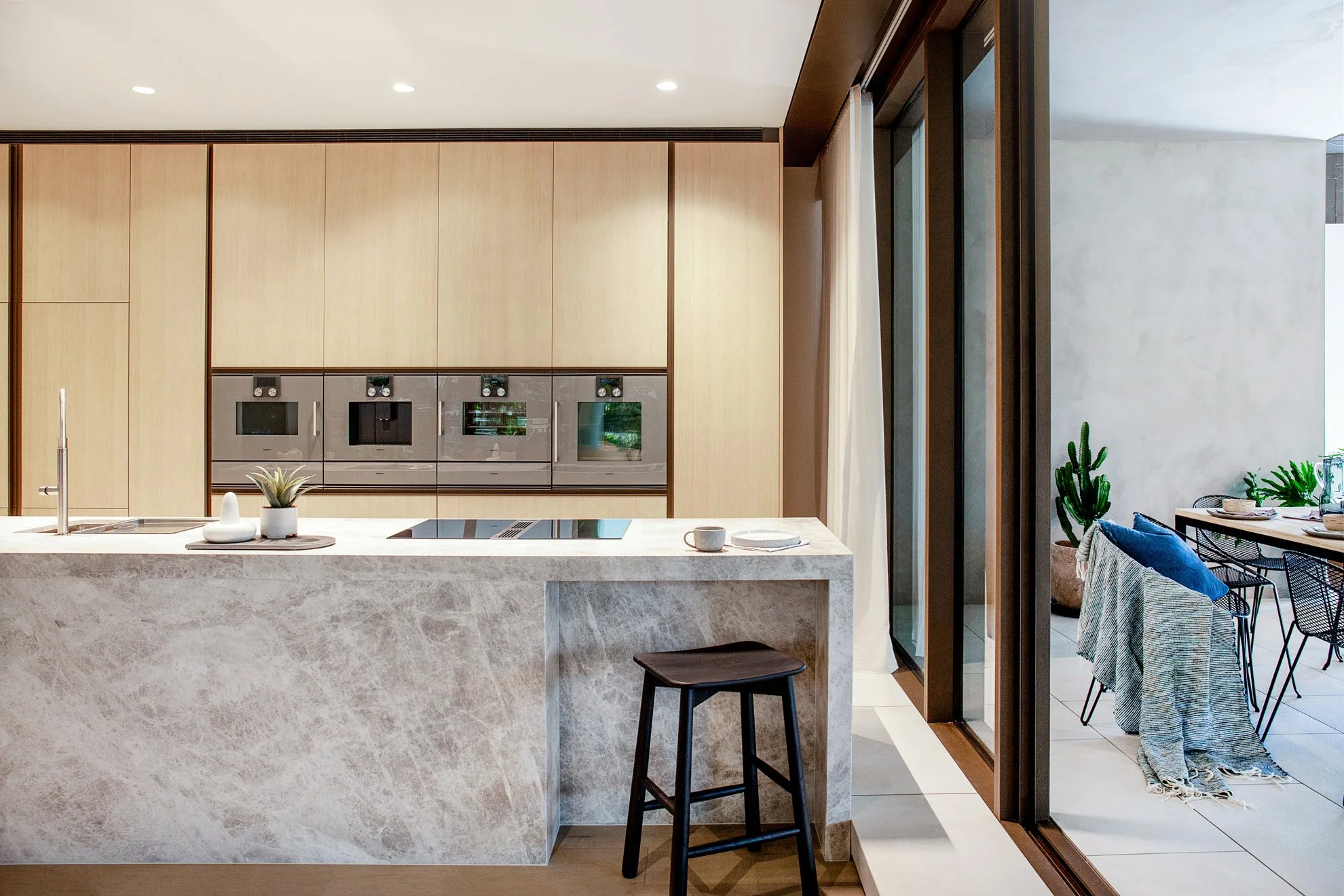
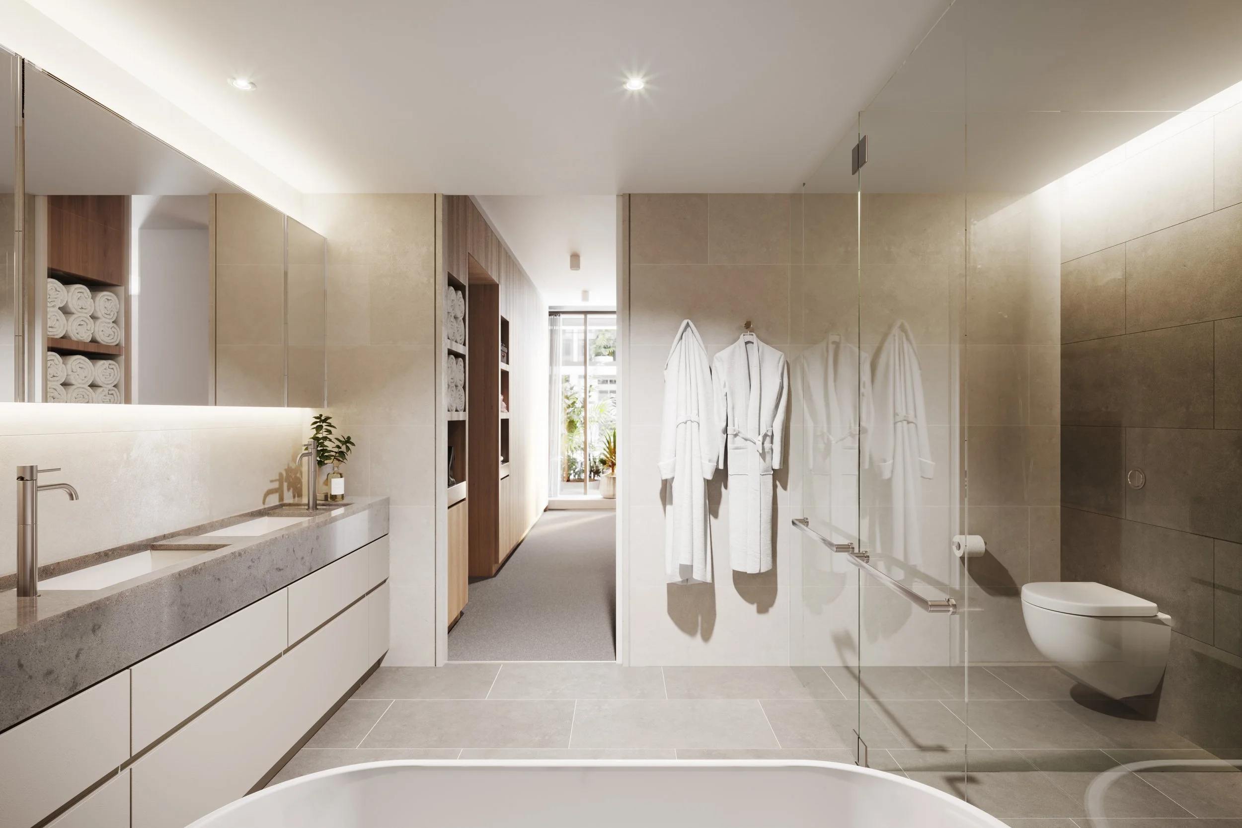
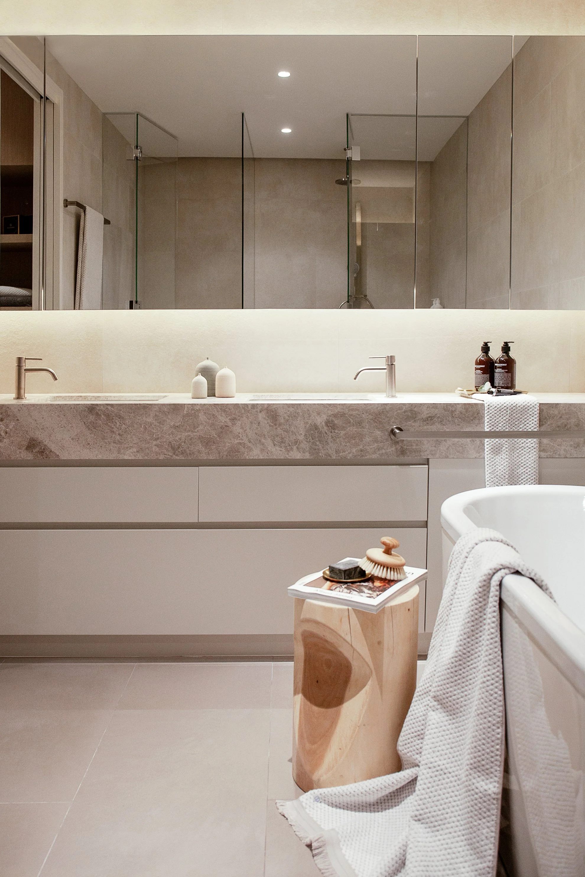
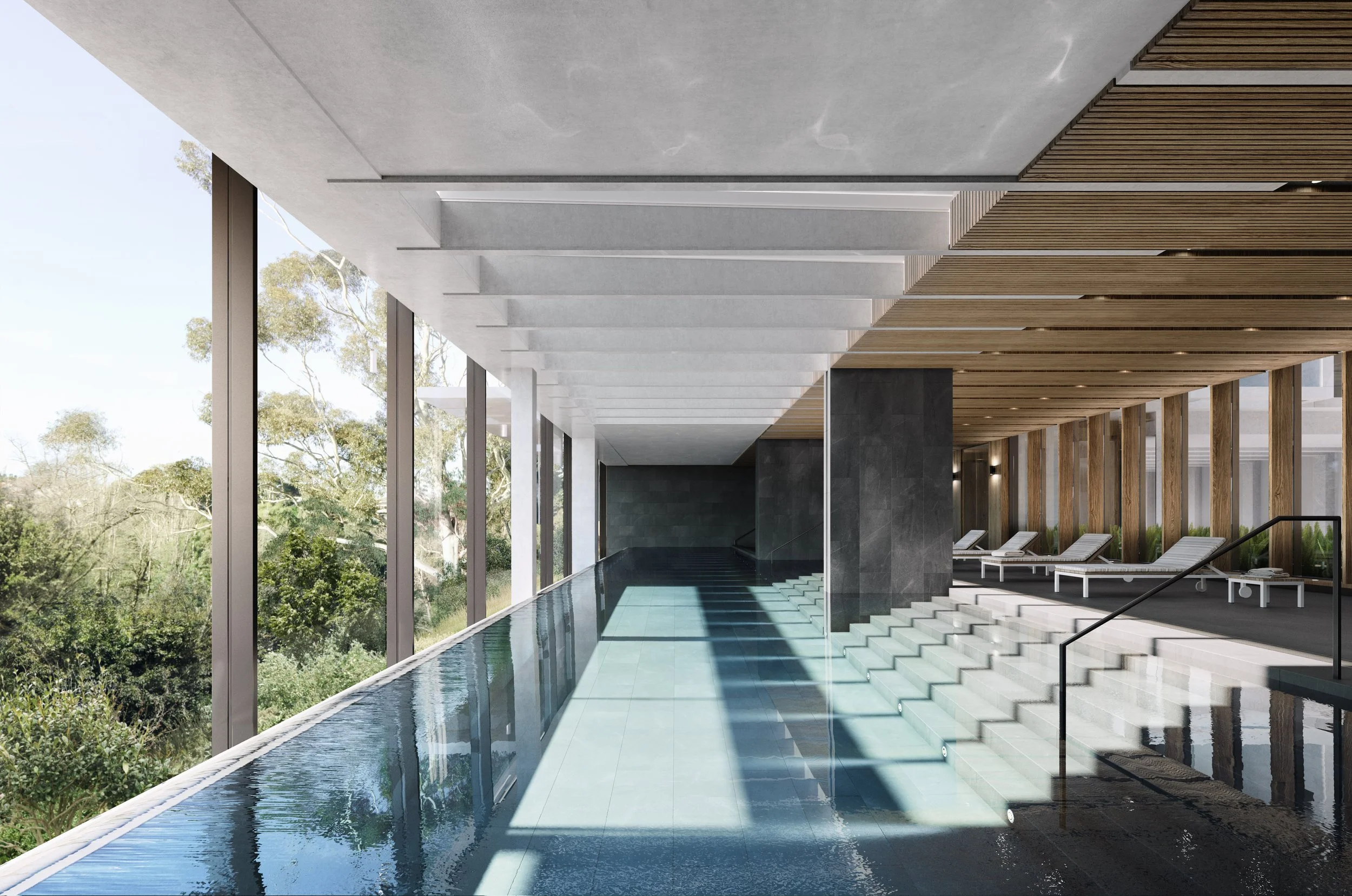
Carrying the vision through to completion: Lobby & resident amenity spaces


As the project moved toward handover, the focus shifted from selling a lifestyle to supporting one.
The lobby and shared resident spaces were styled to be welcoming, durable and genuinely usable, with just enough beauty baked in to deliver a small dopamine hit as part of daily life. Furniture concepts were developed with traffic flow, wear and tear and long-term comfort in mind, rather than how good they’d look on opening night with a glass of champagne in hand.
These spaces needed to feel easy and resolved. Not precious. Not trend driven. Not something you’d easily grow tired of. And definitely not something you’d be nervous to sit on.
Why this approach works (especially on site)
Working across multiple stages of a project forces you to think beyond the final photoshoot.
When the styling and furniture concept is considered early and carried through consistently, it supports smoother coordination, clearer decisions and fewer last-minute compromises. It also helps ensure the finished building feels cohesive, rather than like a collection of good ideas stitched together under time pressure.
For builders and project teams, that consistency usually makes life a little easier. And anything that makes life easier on a building site is worth its weight in gold.
A project measured in years, not mood boards
This project was a good reminder that styling isn’t just about making things look nice. At its best, it shapes how a project is understood, marketed and ultimately lived in.
From early renders to resident handover, the aim was never to shout. It was to stay relevant, feel considered and quietly hold its own over time through a seamless visual language that spoke volumes.
Honestly, those are the projects I enjoy most. Thoughtful, collaborative work that respects the entire journey, right down to the small styling details that collectively shape a successful outcome. It’s an approach that works just as well on smaller residential projects as it does on colossal developments like Walmer.